COLLABORATIVE DESIGN PRACTICE - TASK 3 DESIGN JOURNAL
COLLABORATIVE DESIGN PRACTICE - TASK 3 DESIGN JOURNAL
10TH OCT - 24TH NOV (WEEK 7 - WEEK 9)
NG VEYHAN (0349223) / BACHELORS OF DESIGN (HONS) IN CREATIVE MEDIA
COLLABORATIVE DESIGN PRACTICE
ASSIGNMENTS DOCUMENTATION
Instructions
Research
Task 3 largely consisted of my work in animating the promotional video to be used at The Business School's booth at Innofest. Before starting to draft any storyboards to be used in the video, I began by looking up references that I could use as inspiration.
Many of these contemporary brands use an artstyle with a "hand-drawn" impression to it. One of these videos in particular that caught my eye was one for a local brand of oat milk, Oatbedient. The video used to showcase their product was simple in terms of complexity of the video editing, however the low fidelity of the imagery almost lends it a genuine and relatable atmosphere to it.
(Fig 01, Oatbedient Promotional Video)
Basing my designs onwards with these videos as a reference, I began to draft some storyboards. In discussions with students from TBS, us in the Design School decided to make the video which was more focused on footage that would be taken by the team in charge of social media.
With this idea in mind, I came up with various compositions that would focus on footage of the product as the main foreground object. I also kept in mind that the video might have to sync with audio, in case it was required for a showcase. One aspect that I also tried to experiment with more with the compositions was the transition of camera angles relative to the product. The fact that these images were likely just 2D would make such a transition quite special if pulled off correctly.
(Fig 02, Early Storyboards)
Due to some delays beyond our control, we were unable to obtain the required footage to complete the video in a timely manner. In light of this circumstance, we resorted to using a backup storyboard that I had made in case of this specific situation.
In order to develop this new storyboard, I also had to take into account 3D modelling that I could do to create assets for this video. As much as I would have liked to showcase the actual ice cream itself in this video, it seemed to be impossible for now. Due to time constraints presented by this situation, the storyboard could also only contain still images of the product as 3D assets, instead of having video shots with movements.
As I developed the new storyboard, I came to realize that 15 seconds was actually a really short amount of time in order to convey the information that I would have liked to. Aspects such as being made of oatmilk, or being vegan friendly, were details that were omitted in order to stick within the expect 15s timeframe estimate.
After discussions with TBS, we decide to emphasize the focus on having all real ingredients in their ice cream, therefore the "Real Flavours, Real Ingredients" tag in the video. After settling on the compositions of the shots, I looked for a suitable background track that I could sync it to. It was then added to the storyboard with some inbetween frames added to give it some movement, resulting in the animated storyboard.
(Fig 04, Animated Storyboard)
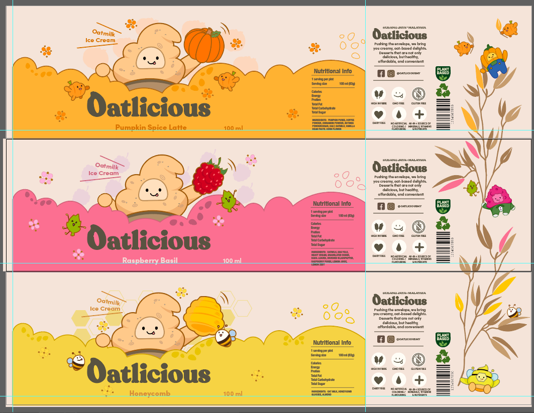
The packaging design in particular, had plenty of great assets to be used in the video.

(Fig 05, Packaging Design File)
For the mascots, I used the Illustrator file that was created for the static poses of each character. The shot featuring all 3 flavors of the ice cream also has the respective mascot character standing behind it. To apply this static pose to this image, I only had to move around the vector points to slightly change their poses and shift their faces to a side to create a look that they were leaning towards a side.
(Fig 06, Static Character Poses)
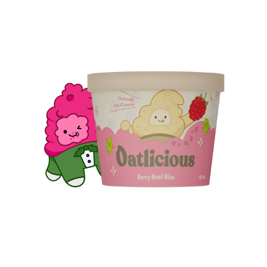
In light of the situation that we were unable to proceed with the product video shoot within the expected day, our team couldn't reliably complete this video on time given a large delay. As this was the only shot in the video that also featured a preview of the physical product, I had to model an ice cream cup in Blender to create a mockup of the cup.
The process itself was quite simple in terms of complexity in Blender, as fortunately the cup was only made up of simple shapes, and we had an actual printable packaging design that I could just wrap around the exterior of the ice cream cup. After exporting an image of a frontal shot of each flavour's ice cream cup, I added the Illustrator character behind them.
(Fig 09, Berry Basil Ice Cream)
(Fig 10, Pumpkin Spice Ice Cream)
Included with the Illustrator files for the characters was also a bunch of simple shapes that were for embellishing the background of the packaging and website. These were also useful for creating new assets for the video as the vague nature of their silhouettes made it possible to combine them to create new objects.
Of course, not all assets are already available from the different sources, therefore I also created some extra assets for the video. Some of these were made from scratch, some of them made with help from pre-existing assets. As the video storyboard was already determined, I was able to comfortably gauge around how many new assets were required to be made, and to be taken from other sources from around the project.
(Fig 12, Artboard for Video Assets)
The audio for the video itself also had to be cut and edited to fit the 15-second window of the animation. For this process, I used a program called REAPER as it is my first choice when it comes to editing any sort of recorded tracks. I cut the audio to the appropriate length and added a fade to the start and the end of the audio track, as well as added some minor audio tweaks to their qualities such as reverb and chorus in order to make the audio transition sound more natural.
Once all the assets were gathered, it was just a matter of combining all the assets according to the storyboard and creatin the final video. The process itself was simple but quite labour intensive as keyframing each individual movement and controlling its velocity was very time consuming.
(Fig 14, Editing the final video)
After some feedback from Ms Lilian and students from TBS, I made some adjustments to the video such as changing the font and some colours of the foreground objects. One of my groupmates, Jia Yee, has brought to my attention a website called Packdora, which specializes in creating mockups for product designs, which conveniently also had a cup with similar dimensions to our ice cream cup.
From this website we created another set of ice cream cups, with more thematically appropriate colouring for the cup as well as better lighting to have better defined colours in the image of the cup.

(Fig 17, Final Animated Video)
Process
WEEK 7: I began focusing on the drafts of the storyboard for our project. As per our discussion during our meeting with The Business School, I had planned to create the storyboard with a focus on actual footage of the product in mind. Taking references from other products that have a modern packaging design and marketing, I felt that these were the most appropriate to draw inspiration as it is targeted towards Gen Z. However, I still maintained another storyboard (which was more graphic-centric) in the backburner in case that there is any unforeseen consequences with the shooting process.
WEEK 8: Earlier in the week, our team had consulted TBS and had gotten the go ahead to finalize our packaging designs and other promotional materials. Unfortunately, there has been some delay in preparing the necessary props to proceed with the shooting. Due to time constraints, we could not wait for these footage any longer, and as a result I've proceeded to work on the backup storyboard I had prepared. I've surveyed and found a suitable music track to be used for the video. There's also quite a rush to prepare the required graphics to be used in the video.
WEEK 9: The promotional video was largely completed at this stage. As I had used the assets provided by my groupmates from other parts of the project. I could at least ensure that the style was consistent across the different materials. However, my arrangement and colour scheme of the different elements of the video could still use some work. There are also more minor details that I should add in order to give the video a more "detailed" appearance. Once all this was completed, the work could be compiled and sent over to TBS.
Feedback
WEEK 7: For this week, we've provided the largely finalised packaging and logo designs. There were also some preliminary GIF animations that will be added into the website in the future.
- The design of the mascots was considered adequate for use in the purposes in our project, therefore efforts should be now focused on creating assets of these characters
- The GIFs were considered rudimentary for now, but they were early drafts with placeholder text still.
- The packaging was largely completed, with only minor changes required for the nutrition labels and ingredient details.
- As the it was still the very early draft stages for the video, I was encouraged to go look for some videos as references to be used for my storyboard.
WEEK 8: No feedback was given this week as it was Independent Learning Week.
WEEK 9: Ms Lilian gave a look through our work this week:
- Some of the minor background elements in the website did not fit the overall design language of our project as they were stock assets.
- The GIF files could use some better placement and could be tweaked a little to better fit the design of the website.
- The video used the title font instead of heading font for the brand, and should be changed as such.
- Inconsistency as the background elements in the video were used as foreground elements elsewhere.
- Colour of objects in the first shot could use some changes, as it is inconsistent with general imagery of the brand.
Next Course of Action
WEEK 7: I was in charge of the storyboard for the video, therefore I would be largely focusing my efforts on drafting the storyboard for the video. Currently, we are expecting the social media team to conduct a photoshoot within the next week to provide assets to be used in the video. Due to the time constraint that we are facing, I would also have to draft another simple storyboard that would use more assets from the other deliverables, in case the photo shooting falls through.
WEEK 8: The design of the packaging would be finalised by this week. By fixing the little details, the assets from packaging and mascot design would be ready to be used as well in the final promotional video. As the footage shooting arranged on the Thursday of this week was delayed, I have to resort to a separate storyboard I had prepared earlier. I would have to look for audio that would properly sync with the storyboard as well as be thematically appropriate.
WEEK 9: The promotional video still remains to be completed due to the delay in video shooting. With help from our group members in charge of illustration and using assets that we have already prepared for different deliverables such as the packaging, we are working quickly to assemble the final animated video. The footage from the social media team had also just come through, which provided with additional materials to be used.


Comments
Post a Comment