MINOR PROJECT - FINAL PROJECT
MINOR PROJECT - FINAL PROJECT
27TH AUG - TBA (WEEK 1 - WEEK 14)
NG VEYHAN (0349223) / BACHELORS OF DESIGN (HONS) IN CREATIVE MEDIA
MINOR PROJECT
ASSIGNMENTS DOCUMENTATION
Module Information
Practical
Basic Research
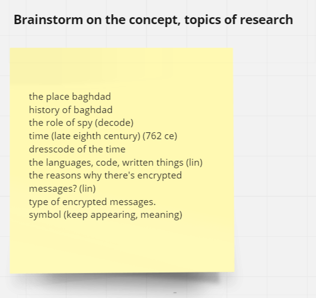
Being assigned to the group in charge of helping develop the proposal and pitch of children's educational show House of Wisdom created by the R&D Studio at Taylor's, we began the entire process by brainstorming. As all of us group members are unfamiliar with even the first thing that comes to Arabian culture and history, we had a lot research to do.
Listing everything that comes to mind, we made a list of possible topics to research and start developing a very basic compilation of images to visualize the environment we are trying to stylize.
(Fig 01, Notes for Possible Research Topics, 6/9/2022)
A little while after just throwing the ideas for research out there, we managed to refine the scope of our search to something that was more detailed. Narrowing down the time period of our research really helped, as House of Wisdom takes place sometime between 8th and 14th century Baghdad, thus there is quite a lot of leeway in terms of historical accuracy.
(Fig 02, More Detailed Search Query, 13/9/2022)
As a team in charge of developing the idea for an animated show, we would have to do some level of research in the current professional field. We all picked an existing animated film and did a case study on the designs of the characters and environment.
Personally, I've chosen The Jungle Book as my choice of research as it involved many designs of animals that I felt would be quite important in the context of developing House of Wisdom as it would feature the appearance of various regional animals.
(Fig 03, Jungle Book Case Study, 20/9/2022)
There aren't many human characters that appear throughout the runtime of this movie, with Mowgli being the only human with any significant screen time. Though the animal designs in this movie are diverse and filled with different points that can be taken.
Some of the notes taken when studying the designs of the animals include:
Friendly animals tend to have a very anthropomorphic body structure, such as bears being bipedal and walking on two legs to appear humanlike and appealing/friendly. Surprisingly, there isn't a trend with friendly looking characters having bigger eyes, which tend to be the case with more modern entries in animated movies.
(Fig 04, King George and Baloo from The Jungle Book, 1967)
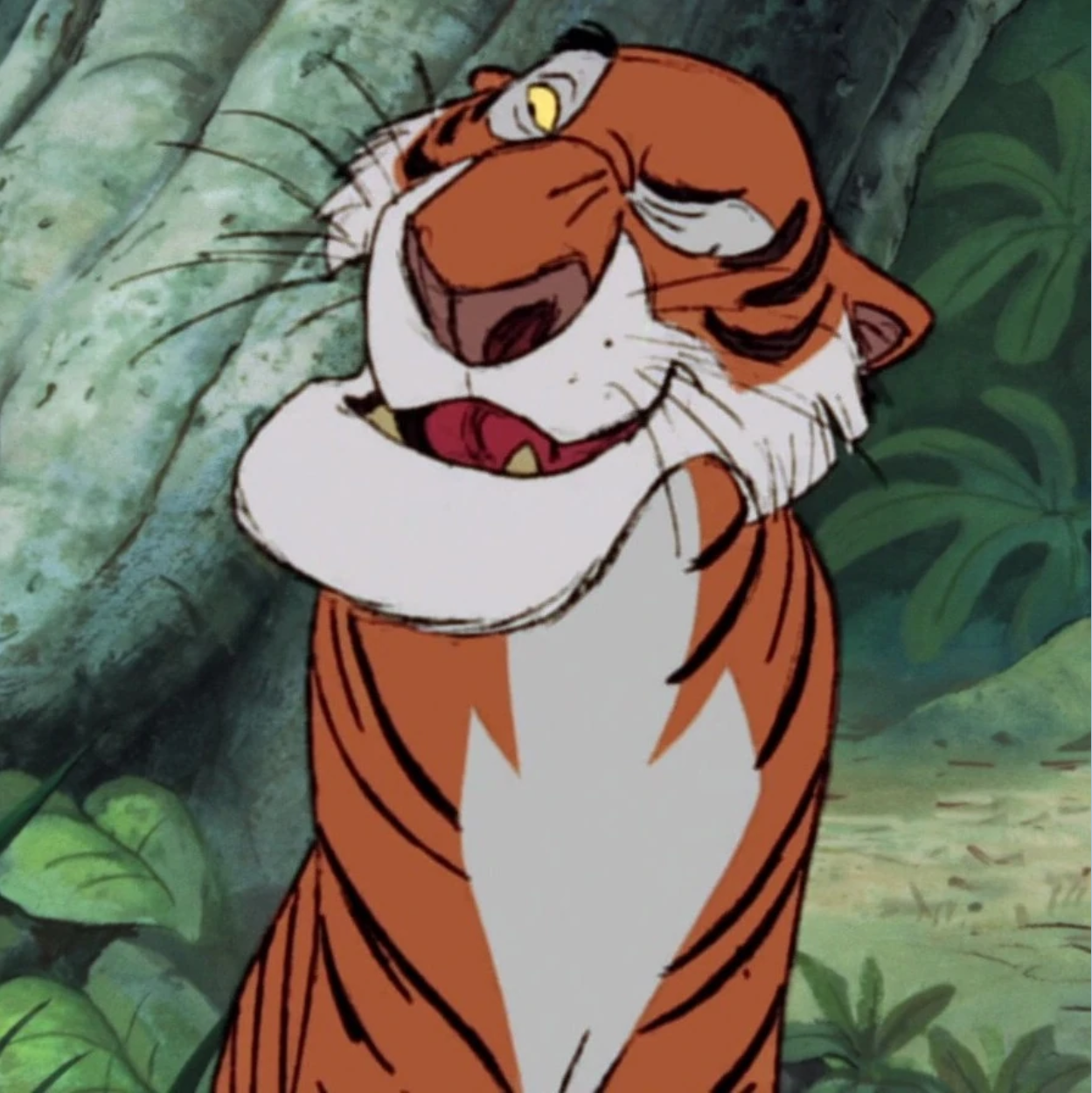
Hostile animals, on the other hand, still retain much of their animalistic body anatomy (as with the tigers), though they act more with a very expressive face capable of making exaggerated gestures. Also, these hostile animals tend to have designs with bigger mouths as well. perhaps to emphasize their predatory nature.
(Fig 04, Shere Khan from The Jungle Book, 1967)
In tandem with doing research for the creative development of House of Wisdom, we are also required to begin the process of doing market research in order to gain a better expectation of the audiences expectations for animated shows in our current time.
We drafted a few user personas of what we expect children in the modern time to be like. Through these fabricated personas, we can make an educated guess on the various motivations, struggles and challenges that the viewer base of this show might experience.
(Fig 05, Sample User Persona, 27/9/2022)
This information is visualized through an empathy map. Similar to what I am currently working on in the UX design module, it organizes the various thoughts of the demographic, including how they might perceive the product and the opinions they might be vocal about, or their own internal feelings being entirely different.
(Fig 06, Empathy Map, 27/9/2022)
To define a concrete goal to achieve when designing everything for the show, we were assigned to write a single problem statement. This boils down all the design goals to a single sentence, and everything proceeding forwards would have to check out with this statement. The choice of words for this problem statement is extremely important otherwise it could cause issues down the road.
(Fig 07, The Problem Statement, 27/9/2022)
After the problem statement was completed, we started working on a few different insight statements. By comparing the users' needs and thoughts, we can understand the thought process of the viewer, to identify more obscure challenges that the viewer might experience, and offer solutions to it.
(Fig 08, Insight Statements, 4/10/2022)
On our end, we also worked on drafting a few statements that would assist us in the designing process. We wanted to maintain accuracy to the actual history and culture of Baghdad. There are also concerns that the level of educational aspects of the show would be too high for the age range of the target audience. As the time period was also a period of scientific development, there is also a lot of misinformation even by reputable scholars, and accuracy of information has to be addressed.
At this stage, we were ready to draft the questions that would be used to gather data on the demographics preferences when it comes to animated shows. As our group members grew up in a slightly different time, there are many differences when it came to trends in exposure to media.
As we are interviewing individuals of a much younger age group, we took care to create questions that were not overly complicated to understand, as they might not be able to fully comprehend the depth of a given question.
(Fig 10, Interview 1 Questions, 8/10/2022)
Also, some much simpler questions like asking their preferences in animals can help decide the two animal side characters that R&D requested that we help develop. Their favourite animated titles could also give insight into their preferred art style.
After all these questions were drafted in a document, they were all transferred into a proper Google Form and then distributed to a few individuals, some with our group members assisting during the interview process to help the individual if they trouble understanding the question.
(Fig 11, Google Forms for Interview 1, 8/10/2022)
As the results came in, we compiled all the answers of each individual to a single piece of text to be able to easily reference and compare the answers given by each individual.
(Fig 12, Interview 1 Results, 21/10/2022)
Our group members didn't comprise of any students from the Entertainment Design specialization, Mr Mike instructed us to create a simple questionnaire for our peers asking for their advice on how to proceed with the art direction of the show. The line of questioning is quite similar to the ones that were distributed to the other demographics, though with the inclusion of questions that were more direct with the topic.
(Fig 13, Peer Interview Questions, 18/10/2022)
After analysing the results given by the target demographic of the show (11-17), we concluded that the information currently was still insufficient and wanted to supplement this lack of information by creating a second set of survey information, but targeted towards an older demographic, specifically between 18-25. The questions in this interview are a lot more direct and to the point, but still made sure that it wasn't difficult to understand for those who aren't too well versed in design glossary.
(Fig 14, Interview 2 Questions, 28/10/2022)
The results from this survey was more helpful than expected, partly due to the fact that the answers given in part by the interviewees were a lot more detailed and descriptive. Therefore we were able to more easily and effectively glean the information we needed from these text responses. However, there are still some difficulties translating answers from the interviews that were done in different languages. (i.e. Chinese)
(Fig 15, Interview 2 Results, 21/10/2022)
Further Research/Production
After getting the results from the survey, we were able to define the direction that we wanted to develop this show. Before that, we had to finish up the research process before we moved on to the production process of this project.
To establish the colour palette for the environments found throughout House of Wisdom, we studied the sets for a few different animated movies.
One example I studied was Syracuse from Sinbad:
- The Mediterranean seaside setting creates a blueish colour palette which may not seem to make much sense in the arid climate of Iran, however it should be noted that Baghdad was built around the Tigris river, and could create an interesting contrast in backdrop at certain scenes.
- Much of the architecture of that show does seem to draw from existing Persian and Arabian sources, with an emphasis on waterworks which are also central to technology in Baghdad during the 10th century.
(Fig 16, Sinbad Case Study, 18/10/2022)
The next example would be the Sultan's palace from Aladdin:
- The orange colour palette is much more reminiscent of the arid landscape commonly associated with the middle east.
- There is an interesting use of maroon as part of wood furniture and fabrics such as tapestries and curtains.
- The architecture of the palace does show an impressive sense of scale which implies a sense of majesty and wealth, which could be incorporated into the design of the House of Wisdom itself.
(Fig 17, Aladdin Case Study, 18/10/2022)
We added some images of the real life inspirations for various elements of the show as a sort of guideline. These props, characters and environment should somewhat resemble the images presented here, even if they may not be an exact copy. However in terms of character design, it is still a lot more open in terms of ideation.
(Fig 18, Basic Design Guides, 5/11/2022)
For character designs, I was personally in charge of designing three scholars that serve as side characters that were separate from the main cast, most likely interacting with the main characters on a per-episode basis.
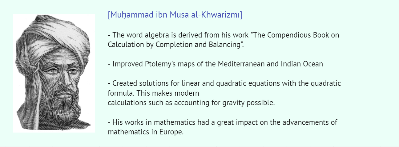
Before working on any designs, I needed to familiarize myself with some big names during this time period and their achievements. With this I can come up with archetypes for these characters and their personalities as there aren't many records of them as individuals.
One concern about these characters is that I felt that many of them looked too similar, with a turban and loose-fitting robes. This issue should be addressed with more distinguishable attire and props they carry around.

(Fig 19, Scholar Research, 8/11/2022)
The category of designs I was mainly in charge of was for designs for props that the characters would interact with in the show. The difference between what is considered a prop as compared with an object in the background is that it has to be designed in a way that makes it easier to animate as the character interacts with it.
A great number of inventions were created during this time, most of them relating to scientific advancements. These have to be kept as scientifically accurate as possible, as an educational show it is essential that viewers are well informed with correct information.
(Fig 20, Early Prop Design, 8/11/2022)
Approaching the last part of the semester, it was time to focus on the full-on production process of the project. I began to work on the props first as it was the quickest to complete and hand to my teammates for further refinement and development.
First I approached the design for a key that was elaborated on by R&D during consultation, as it would be used by an advanced mystery faction in the show. For this design I took some inspiration from antique keys.
(Fig 21, Antique Key References, 12/11/2022)
For the art of the key itself, I wanted to give it more heft and made the shaft of the key much thicker. A gem is embedded into the "eye" of the key, with intricate detailing on the head of key to denote status and manpower of the organization to create such an extravagant key.
(Fig 22, Secret Key Drawing, 12/11/2022)
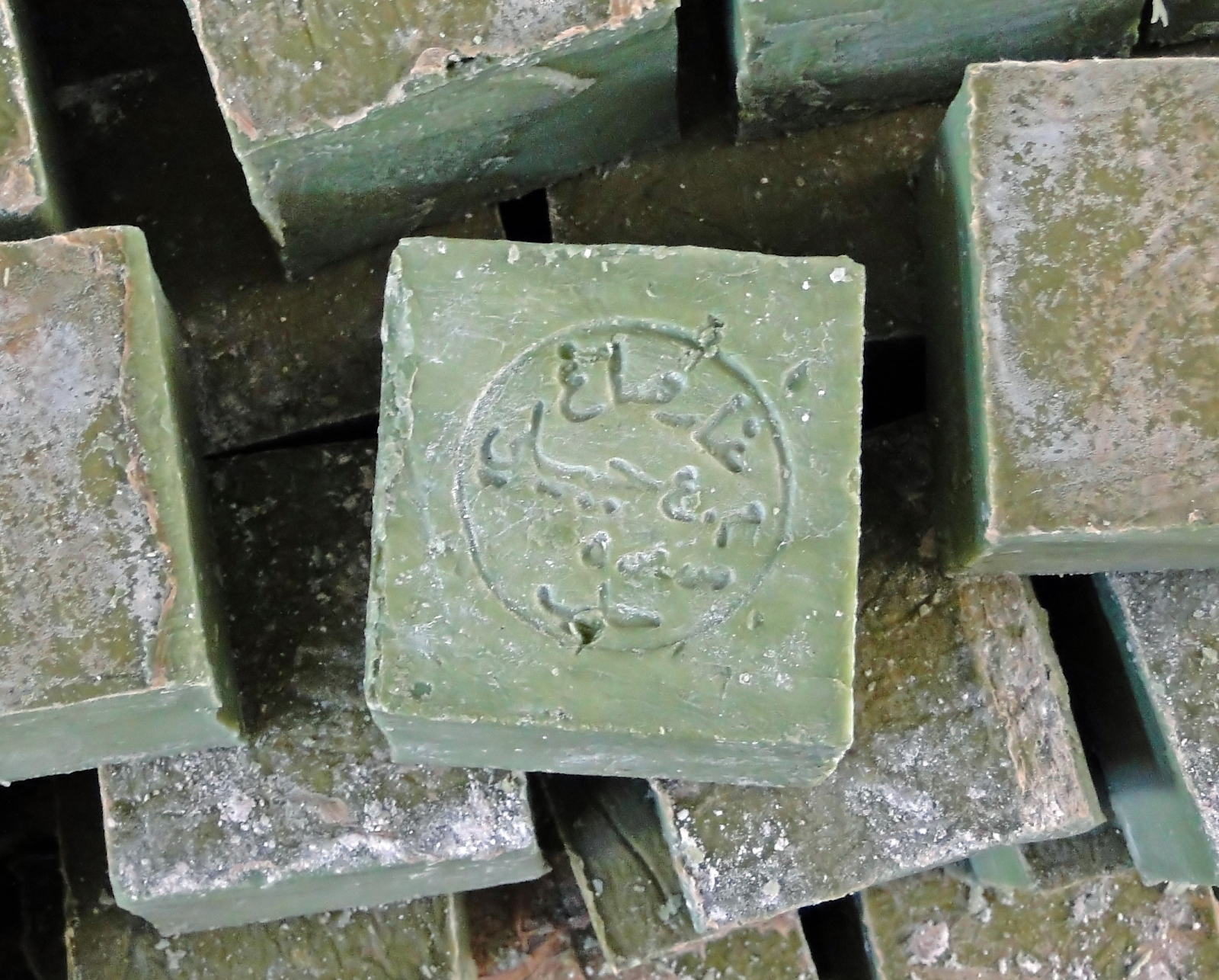
Another et of props that I wanted to design were those that could be encountered during the day-to-day of the main characters. Some products that are found in a Iranian market during that time period would include hygiene products as it was a time when medical practices were developing. As such, products such as soap were developed.
(Fig 23, Aleppo Soaps, 13/11/2022)
Most of these common household items are quite plain-looking, as it should be to reduce production costs. However, in the context of an animated show such as House of Wisdom, it made sense to add a little flair that still kept the prop historically accurate, like having a laurel leaf stamped onto the surface of the soap, which is its primary ingredient.
(Fig 24, Sketch of Arabian Hygiene Products, 13/11/2022)
The abacus prop also suffered from this issue of being too average looking. The most I could do for this design was to create one with a blueprint of a mechanically accurate abacus.
(Fig 25, Sketch of Abacus Prop 13/11/2022)
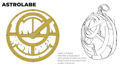
The most challenging props to design for House of Wisdom were the scientific props pertaining to astral navigation. The amount of detailing in each of these objects are much more than I could accurately understand given the timeframe of this project.
(Fig 26, Astrolabe Example, 13/11/2022)
What made the astrolabe so difficult to design is that every single detail of the object serves a purpose. Even little curves and edges that may seem purely ornamental at first actually serves as a marker to be aligned with the position of different stars to get the users current position based on triangulation.
(Fig 27, Astrolabe Sketch, 13/11/2022)
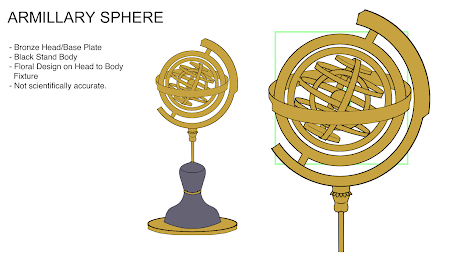
The design of the armillary is also similarly complicated. Also, I noticed that the armillary sphere works off the principles of a geocentric model of the universe, which is scientifically inaccurate as of modern times, but shouldn't concern the setting of the show.
(Fig 29, Armillary Sphere Sketch, 14/11/2022)
The design of the telescope, however, was completely my own design. Though the design of the basic telescope was too simple to have any actual change, a more advanced version of the telescope used by the mystery faction is more open-ended in terms of design.
I took into account the plausibility for the technology of the more advanced telescope to exist during its time. While somewhat far-fetched and high tech for what is commonly seen during that time, it could make sense if the stars aligned.
(Fig 30, Telescope Sketch, 14/11/2022)
(Fig 31, Alembic Sketch, 15/11/2022)
After a consultation with Mr. Mike, we realized that we hadn't created any prop designs that had accounted for the diminishing of details over distance, we rectified this by adding variations of these designs at different distances.
(Fig 32, Variable Sketches, 21/11/2022)
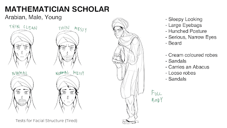
Moving on from the props I proceeded onto designing the three scholars that would make appearances in the show. The scholars would comprise of an largely international cast, with scholars from all over bringing knowledge to the House of Wisdom.
First was the Mathematician scholar who originates locally from Baghdad. As mathematics is associated with a lot of deskwork, I envisioned him as a sort of overworked person, therefore his build is thin with a hunch when walking. Eyebags under his eyes also help give a gaunt look to his face, as well as the loose and messy robes making him less well put together and more focused on his research rather than himself.
(Fig 33, Mathematician Scholar Sketch, 15/11/2022)
The next scholar I designed is female, despite the historical lack of female representation in the world of academics during that time. She is the archetypical beauty who specializes in the arts, particularly in music and dance, and comes from India. Originally, her design incorporated the traditional sari garment from India, however the multiple layers of fabric didn't make much sense in the climate of Baghdad. Therefore for her outfit I included elements of outfits from traditional Arabian/Persian nomad dancers.
(Fig 34, Musician Scholar Sketch, 16/11/2022)
The last scholar I was in charge of designing is a scholar that specializes in astronomy who hails from Greece. For his design I wanted to try a variety of hairstyles to see which would suit his personality the best. I wanted to include a hairstyle that is long for his character, but the fluffy look of short, curly white hair made him seem much more friendly and affable than the rest, complementing his personality the best.
(Fig 35, Astronomy Scholar Sketch, 16/11/2022)
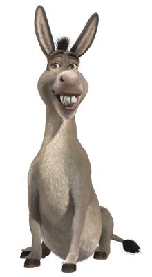
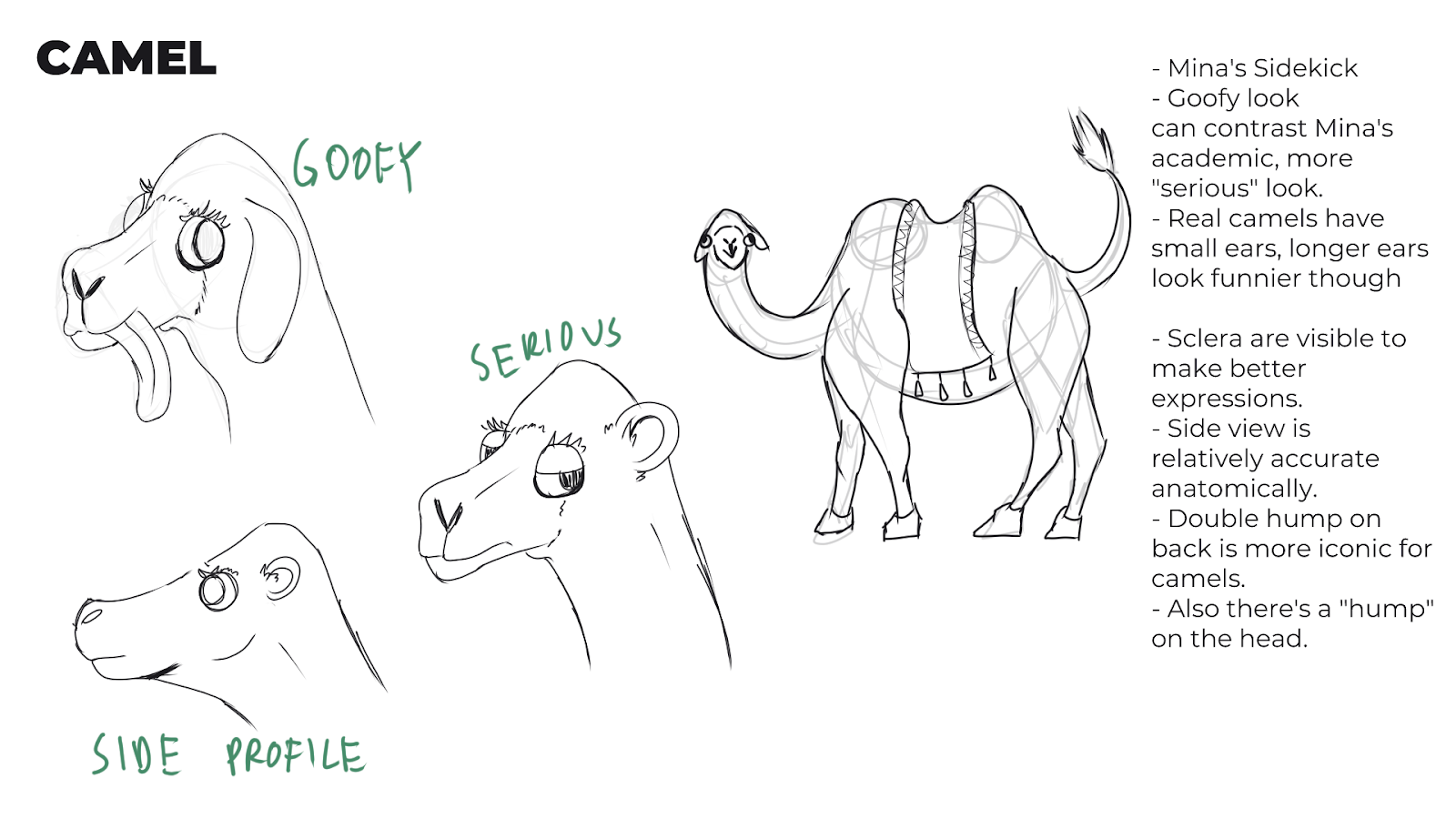
After the scholars, I would also design the two animal characters that would accompany Zidan and Mina in their travels. One of the animals, Mina's pet, is a camel. For this character, I took inspiration from the character Donkey from the Shrek series of movies.
(Fig 36, Donkey from Shrek, 2001)
To complement Mina's more serious personality, the camel would be more of a goofy character. having bigger eyes on the camel also helps it come across as more expressive. After some feedback though, its anatomy does seem somewhat more like a horse than a came.
(Fig 37, Camel Sketch, 20/11/2022)
The other animal character is Zidan's pet tortoise, named Yaqut. When it comes to tortoises in real life, they aren't very expressive as they don't have facial muscles and such. Thus most of the character and personality of this tortoise I felt has to be achieved by just going more free with its head anatomy.
After completing the sketches of the characters, I moved on designing a few concept art pieces to be used during the presentation. As I sometimes do illustrating as a hobby, I felt that I was able to produce some interesting looking compositions for these artworks.
For example, the observatory sketch shows the scale of the sky above the scholar as he gazes upwards in wonder. The upward camera angle from below also shows the scholar in a confident but curious light.
Reflection
WEEK 1: We did some initial research on the basic time period in which the show would be set. (Major occurences of the time period) Based on the collected information of the time period, throwing out basic ideas on potential premises and progression of the storyline. From sharing our ideas on how the story could develop, I realized that there is much potential in the fantasy aspect of the story, whether it would be suitable to incorporate more or less such elements in the story still remains to be seen. The brainstorming session did allow me to realize that at the very beginning of the conceptual stage, all ideas are valid, no matter how outlandish it may seem initially.
WEEK 2: Between this and the previous week, we scheduled a meeting with the R&D studio. From that meeting, we were instructed on what was currently lacking in the direction of the project and what was expected of us. As the storyline is mostly up to the people in R&D, as a group we were supposed to create a set of characters based on actual Islamic researchers, as well as the props and environment appropriate to that particular era. We started drafting some interview questions that we would use to narrow down our target audience.
WEEK 3: This week, we started off by drafting some user personas that we would use to gauge the basic audience of the show. Initially, we thought that our group was responsible for creating or re-designing the entire cast of characters for the show, however after a consultation we were assigned to work on the side characters. We also began drafting the interview questions that we would use to gather data on the direction that we wanted to take the design of the show. After completing the questions, we would have to distribute them next week.
WEEK 4: We began collecting the responses for the questions in our interview this week. Getting ahold of interviewees within the proposed age range proved to be a challenge. However, after collecting some responses, we decided the data was inconducive and insufficient to form strong enough evidence to justify taking the designs in a certain direction. To further supplement the data from interviews, we began working on questions for an online questionnaire that would be distributed to the general public. At this stage, we began working on the structure of the proposal slides that were to be compiled and submitted a few weeks later.
WEEK 5: For this week, I managed to complete a number of prop ideas that I expected would appear within the premise of the show.
WEEK 6: After some consideration of the results that we gained from the questionnaire and interview, we came to a conclusion that the age range of the audience was too young. We tried expanding the range of the target audience from 10 to 29 years-old, but then it was too broad and encompassed demographics of many different education levels. Mr. Mike advised us to keep the target age range below college age, as the education level of their age was too high. After a while, we managed to get in contact with R&D studio and consulted them in a short meeting. Ms. Zaidah from R&D gave us some more clear cut ideas on how the story of the show would be structured, and some examples of locales where the series would take place. With that in mind, we were able to focus our research within a narrower field.
WEEK 7: Before we continued with further development of the current character designs, we consulted the R&D studio to confirm if whether the direction we were taking the characters was accurate to their expectations. They noted that as designers, our own choices in whether a character design accurately portrays their personality would take precedence over those of the viewer base. However some aspects couldn’t be compromised, particularly with the environment and outfit designs which were to stay historically accurate to prevent misinformation in an educational show.
WEEK 8: We had an arranged meeting with R&D and Mr. Mike for further consultation.
WEEK 9: As our group was about to enter the full production process for the assets that would be proposed for use in the project, we divided designing different types of assets among us according to our strengths. I was assigned to design props and characters, with the environment afterwards.
WEEK 10: I did some research on some different attires coming from nations outside Iran during the 8th-10th century. As the House of Wisdom is pictured as a multicultural hub and knowledge repository, it is also been recorded that scholars from different regions would study there as well. The designs of scholars were more varied with more expansive colour palettes and shape profiles. However, I still required some teammates to polish my designs to match the art style.
WEEK 11: This week, I have completed the designs for most of the props that we would utilize in the presentation. Historically speaking, most common objects were quite simple and without any decorative details due to the technology and subsequent production costs that the items would require at the time. Therefore the challenge came in designing props that were both appealing and still accurate.
WEEK 12: Some feedback from Mr Mike mentioned that we hadn’t provided alternative prop designs that were created from views at different distances. The diminishing of details should be taken into account when creating these extra designs. On the side, I began working on the basic sketches for some scenes in the environment.
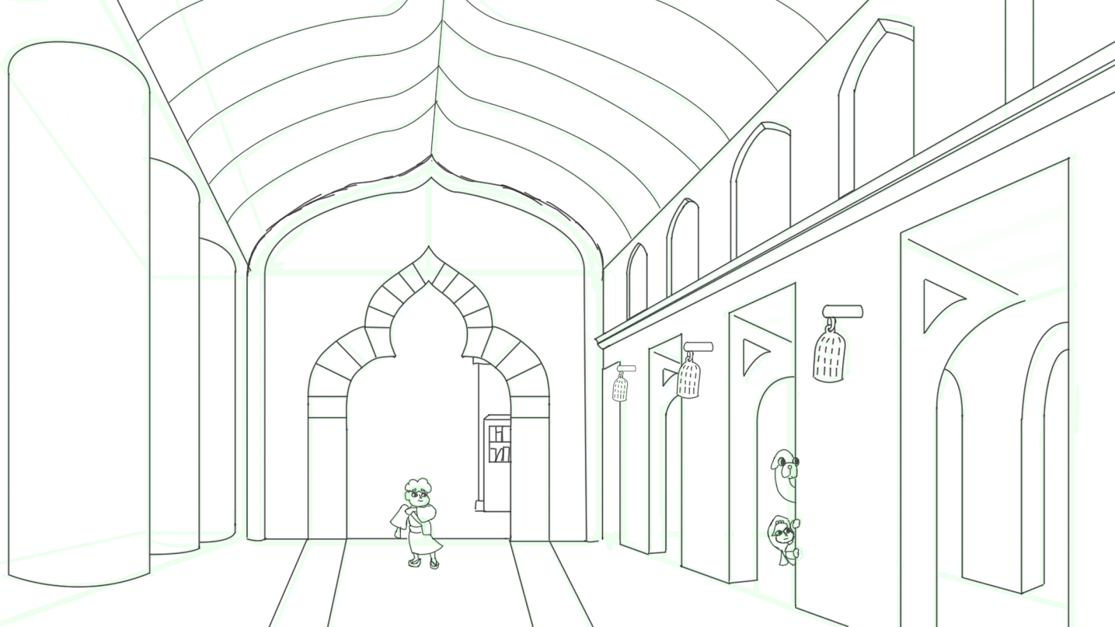
WEEK 13: Most of my efforts were focused on designing different environment sets for the show, without characters. Depending on what locations were being sketched, I wanted to emphasize the scale of each locations with more dramatic size differences between subjects and the backdrop, however due to the constraint of historical accuracy, I had to be more cautious in this respect as most of these places in reality are quite “average” compared to modern architecture.
WEEK 14: After another quick consultation, some issues with our current designs for the environment and concept art involve the lack of perspective and depth in these art pieces. As I was the most familiar with illustrating with this concept in mind, I was assigned a few more pieces to complete this week. The workload was a little hectic as the deadline approaches.
END OF SEMESTER REFLECTION
Experience
Working in a team is extremely challenging, as all the members have to account for each others strengths and weaknesses. Strong leadership is essential to the cooperation of any team especially if there is an unexpected delay or loss of manpower, someone has to be able to direct everyone to pick up the pieces. If anything, this module seemed more like a teambuilding and communicating module rather than an exercise on design skills.
Observation
Over the course of this semester, I have noticed that it is quite difficult to keep a consistent quality of work over an extended period of time. Especially when times such as deadlines are approaching, there comes a decision whether to allocate resources to more important aspects of a project and cut some losses or trying to push for maximum quality.
Findings
Workflow control is one of the main deciding factors of the success of a project. The ability to distribute work according to each members strengths can help increase the speed and efficiency that a project is completed at. Also being able to organize work so that as many people can be working as possible can also reduce the overall time required for the project.

















Comments
Post a Comment