MOTION GRAPHICS AND COMPOSITING - FINAL PROJECT
MOTION GRAPHICS AND COMPOSITING - FINAL PROJECT
27TH AUG - TBA (WEEK 1 - WEEK 14)
NG VEYHAN (0349223) / BACHELORS OF DESIGN (HONS) IN CREATIVE MEDIA
MOTION GRAPHICS AND COMPOSITING
ASSIGNMENTS DOCUMENTATION
Module Information
Practical
For week 1, we did some simple introductions to the basics of the module and what were expected of us. We were then instructed to bring some magazine cutouts the next week to create a collage for an exercise in visual hierarchy.
The exercise was a back-to-basics refresher to get us back up to speed on some of the design aspects that were covered in previous semesters. Concepts such as contrast, balance and emphasis along with the other main design principles were the focus.
(Fig 01, Physical Collage, 5/9/2022)
Next week, we moved on to digital, to refresh us on the usage of After Effects after the semester break, we were instructed to create a digital collage in Photoshop that would later be animated in After Effects. We were saved the trouble of having to look for our own assets as Mr. Fauzi had already provided us with some pictures.
First, the collage was created in Photoshop. Trying to keep in mind the aspects of composition, I used the paper planes to create a sense of flow pointing towards the head of the subject person. I masked out the rapier on his hand to a separate layer to create a 3D puppet movement later on in After Effects. A picture of buildings set to a multiply layer in the background helped create some texture in the background as well.
(Fig 02, Digital Collage, 20/9/2022)
The next exercise we were instructed to make was one on kinetic typography. Taking a word, we were supposed to animate the text according to what it describes. In my case, I opted for the word "shuffle" as my choice of word to be used in the exercise.
When thinking about what the word "shuffle" represents, some adjectives that came to mind for the word was randomness and mystery. Therefore, in this kinetic typography exercise, I wanted to ensure that the movement of the text was both random and mysterious. In other words, I wanted to keep the viewer guessing.
To emphasize this aspect of randomness, animations of the text include separating all the letters of the word and making them transition in by shifting into place from above and below in no particular arrangement or pattern.
(Fig 03, Individual Letter Animation, 1/10/2022)
Another way to emphasize the randomness of the word was to have it teleport across random locations on the screen. As the text remains the same, it would remain legible despite the erratic movement of the text. It also helps that the text is quite large as the viewer would still be aware what the text is as it has already been established.
(Fig 04, Teleporting Words Animation, 1/10/2022)
Following in the theme of the word "shuffle", one thing that comes to mind is the shuffling of a deck of cards. Animating the text similarly to an actual shuffling of a card deck, the "S" of the word would switch places with the next letter as it travels across the screen. Once this misspelled word is formed, the whole word would shift around in blocks to recreate the accurate word.
(Fig 05, Shuffle Animation, 1/10/2022)
(Fig 06, Kinetic Typography, 1/10/2022)
PROJECT 1
As a project focused on different the different aspects of motion used when creating moving graphics, it also served as a basic introduction to the technical parts of the module as well.
We were only required to create 4 extra motion graphic examples for these principles, being Scale, Focus, Symmetry and Rhythm. Each of these little animations should have an emphasis on their own part of motion graphics design.
FOCUS: Wanting the viewer to direct their attention to one part of the screen. To achieve this, the use of four "arms" that all converge on the dot in the center of the screen helps direct the viewers eyes to the middle. As the arms rotate, the center remains unmoving, therefore creating a focal point for the eyes.
(Fig 07, "Focus" Composition, 13/10/2022)
SCALE: Focusing on creating a sense of size between different parts of the composition, I went for a design reminiscent of the D-pad found on game controllers. Like scrolling between selections of different buttons, this animation is a corresponding size increase in a targeted "button" creating a focus on one particular button at a time through the use of scale.
(Fig 08, "Scale" Composition, 13/10/2022)
SYMMETRY: The idea behind this design was rather straightforward, it consisted of symmetrical geometric shapes with animations that mirrored each other across a horizontal or vertical axis through the middle of the composition.
(Fig 09, "Symmetry" Composition, 13/10/2022)
RHYTHM: To create a sense of rhythm across this composition, I took inspiration from the game "Pong". As the ball in that game travels at a constant speed across the speed horizontally, the ball would always collide with a players' bumper at a fixed rhythm, therefore it made a good example of this aspect of motion graphics.
(Fig 11, Project 1 Comp Collage, 13/10/2022)
(Fig 12, Creating PROJECT 1 composition, 17/10/2022)
(Fig 12, PROJECT 1 Composition Animation, 18/10/2022)
PROJECT 2
The goal of this project was to create a short motion graphic lasting a few seconds introducing or promoting a particular website or service. As I was a hobbyist illustrator, one of the main programs I use is Clip Studio Paint, which doesn't seem like it has a strong marketing campaign outside of its domestic market in Japan.
Using this program as the base, I did some research on the aspects of the program that could be emphasized in such a short duration. Initially I wanted to just touch on the capabilities of the software, such as brushes, or ready-made assets. However, there isn't enough time in the composition to do so, therefore, a quick art showcase was the road to take.
(Fig 13, Composition Sketches 01, 22/10/2022)
Initially I had plans to include a small mascot character, however due to the timeframe of the project I found it unfeasible to include such an element to the composition, and as such left it out. Instead I worked more on trying to sketch out possible ways to present said information.
(Fig 14, Composition Sketches 02, 22/10/2022)
After some considerations on the color palette of the composition and what artists to include in this showcase, I finished up a deck detailing the different aspects that I would include in this composition.
(Fig 15, PROJECT 2 deck, 23/10/2022)
For the first part of the animation having a solid block with the Clip Studio Paint moving up from below was impossible to create in After Effects as the object needed to have depth to it. Therefore the only solution at this stage was to utilize 3D animation. I did a very quick model in Blender with a green screen to help screen out the object from the render later on.
(Fig 16, CSP logo modelling, 25/10/2022)
Importing this to After Effects I was able to continue working on the rest of this project. I had to look for community artworks that made use of Clip Studio Paint as an example of its capabilities. Fortunately, there are a great number of artists who do use this software on YouTube, despite its main userbase being in Japan.
(Fig 17, Clip Studio Paint Animated Logo, 25/10/2022)
Downloading the time lapse of the artwork being created, it served as a good backdrop for the composition when showcasing the final artwork.
However, an unedited version of the footage would be too distracting with its constant movement in the background. As such, the solution I came up with for this problem was to darken the entire footage enough so that there is movement perceived in the background, but not enough to warrant any attention from the viewer, and away from the finished art piece.
The effect used to achieve the less saturated look for the background is achieved using a levels effect, and lightening the shadows.
(Fig 18, Background Effects, 25/10/2022)
To transition in completed artwork and details of the artwork, the assets are converted to a 3D object and then set to an initial rotation perpendicular to the screen, rotating and appearing from being near invisible.
(Fig 19, 3D Transform, 26/10/2022)
To switch from the scene showcasing one piece of artwork to the next, a solid grey rectangle that is skewed slightly diagonally was used, as the slanting gave the shape a little more "movement". A mask follows behind this shapes which then brings in the next scene.
(Fig 21, PROJECT 2 Final Video, 28/10/2022)
PROJECT 3
This project serves as a sort of continuation for the previous project. Using the ideas from the previous assignment, the task this time around was to create a short bumper advertising the selected website/service.
Continuing with the ideas that were left out from the previous project due to its limitations, it could be used for this assignment. I experimented with a number of new compositions, some utilizing the idea of a mascot.
(Fig 22, Sketch 01, 02/11/2022)
For most of these sketches, I used different colours to denote depth in terms of the composition as I had intended to use the 3D object animation features offered by After Effects. It also helped me to quickly refer to these sketches when composing the scene.
(Fig 23, Sketch 02, 02/11/2022)
(Fig 24, Sketch 03, 02/11/2022)
I started the production process for this project by creating the art of the mascot that would appear on the video. Using some experience from illustrating, I made a basic illustration of a character, with 2 different expressions to switch between during the animation. Most of the other 2D assets were also done at this stage, though logos and such were much more simple.
..
(Fig 25, Character Illustration, 09/11/2022)
Some of the animated elements are done completely within After Effects, such as the play button that appears near the beginning of the video. Mostly done using solid shapes, a combination of position, rotation and shape properties such as stroke widths.
(Fig 25, Play Button Animation, 12/11/2022)
The composition is layered as 3D objects and and helps create a sense of depth in this composition. With this, the elements can be separately rotated from the background and makes the composition look more interesting when transitioning to the next scene.
(Fig 26, Composing 3D Assets, 12/11/2022)
The mascot would change expressions midway through its scene. To achieve this effect, the two images were put together in a single composition, with one being switched in directly after the other. This composition was then treated as I would any other image asset.
(Fig 27, Composing Character, 12/11/2022)
For some effects like the Repetile on the rotated words, I took special care to animate the words to make them appear according to the beat of the music. The colour switch between different halves of the composition background was quite tricky, as it required me to compose a completely new identical composition rather than masking an effect over the existing one.
(Fig 29, PROJECT 3 Final Video, 17/11/2022)
PROJECT 4
This project centers around using a central theme to create a motion graphics video that would convey a message. Considering all my options, I eventually settled on a video that would talk about games as a form of stress relief.
When talking about games as a subject matter, I felt it was right to include references to existing facets of gaming culture. Especially for games with iconic characters or titles that have gained a cult following after many years from release.
Following the style of the previous projects, I wanted to maintain a clean and simple look for the style of assets, partly due to the fact it is easier to produce and control everything within After Effects.
I began by sketching some initial compositions for different segments of the video. I kept in mind particularly the compositions that were done in Project 1, by using parts of assets to transition to the next one.
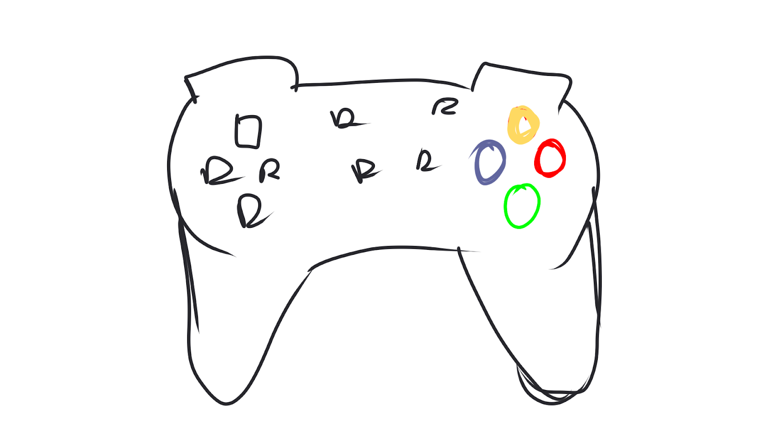
(Fig 30, Controller Comp Sketch, 21/11/2022)
For example, the four coloured buttons on the graphic of a game controller can be used as a rotating display for the next set of content. In this case, I wanted to display the icons of some popular games to showcase the roster of games that are available for everyone to play.
(Fig 32, PROJECT 4 Deck, 23/11/2022)
Most of the assets used in the video have an overly complex shape to be created solely with the shape tools in After Effects. They were instead created in Clip Studio Paint and then exported as a png to be later used in After Effects. This also allowed me to create the image assets in a more consistent style that would look well when combined.
(Fig 33, Illustrating 2D Assets, 25/11/2022)
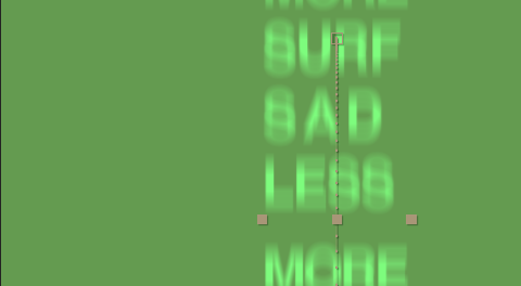
During the animation process, one of the trickier effects was to create a fast scrolling effect with lots of rows of text. As it is unpractical to type that many rows of text manually, a Repetile effect is used during its very fast and blurry portion to create the illusion that there are many different words used for the entire text box.
(Fig 34, Repetile Text Scroll, 30/11/2022)
It is then masked to a solid shape rectangle to create focus on one specific word, rather than having the audience read through all the text on a screen.
(Fig 35, Masked Text Scroll, 30/11/2022)
To achieve the animation of zooming into the four buttons and rotating them to display a series of icons, there has to be quite a few layers of compositions as many of these assets have to be contained within another. Each of the four buttons are divided into their own individual compositions, with all 4 being combined into a square composition, which allowed for a central rotation anchor point of all 4. This composition containing all 4 buttons is then parented to the same null object as the white controller graphic.
(Fig 36, Controller Comp Arrangement, 30/11/2022)
Each of the four buttons had their own composition that was relatively simple. The graphic of an icon is sandwiched between two circle shapes, with the one above being applied with a transition that removes it, revealing the icon and the circle as its background. The icon itself had to be rotated to keep it in the correct orientation as it rotates in its parent composition.
(Fig 37, Button Comp Arrangement, 30/11/2022)
For the sequence with a row of hearts expanding and then shifting diagonally away from the camera. It was done by creating a composition with a heart shape and an empty shape behind it to create some space between each heart in the Repetile when it is applied to this composition. This composition is also given 3D object properties to make it shift away in the Z axis.
(Fig 38, Heart Row Expand Effect, 2/12/2022)
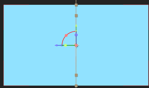
One of the transition methods between scenes is also by rotating the assets by 180 degrees on the Z axis and cutting it just as it reaches 90 degrees. The next asset is then put in place with the identical rotation angle as it appears, making it look like the previous asset transformed into the next.
(Fig 39, Flip Transition Effect Climax, 2/12/2022)
For the composition with a dialogue box similar to visual novel games, the text has to appear in a typewriter fashion which is how text is presented in this category of games. Fortunately, after Effects does provide a typewriter animation for its text. I did add a pause between the two sentences for the animation to give the reader a little time to catch up with the appearance of text.
(Fig 41, PROJECT 4 Final Video, 3/12/2022)
Feedback
WEEK 1: No feedback yet as it was the first week of the semester.
WEEK 2: The use of layering in the composition was interesting. I did not have to add too many background elements to the composition as the exercise was reliant more on just the visual hierarchy of objects in the foreground. The silhouette of the composition would then be more interesting rather than
just a few geometric shapes.
WEEK 3: The collage used for the simple animation for After Effects was good and usable in the context of being used as a starting point to refresh on the usage of After Effects.
WEEK 4:
WEEK 5:
WEEK 6:
WEEK 7:
WEEK 8: No classes this week as it was Independent Learning Week.
WEEK 9:
WEEK 10:
WEEK 11:
WEEK 12: No classes this week as it clashed with a holiday.
WEEK 13:
WEEK 14:
Reflection
WEEK 1: For the first week, we were just introduced to the basics of this module and the work that is expected from us. All in all, it was a pretty standard start for the semester.
WEEK 2: It was quite a fun experience, being able to use our own hands to physically interact with the creative process. Deciding what elements to cut out and use in the collage was something that required more consideration than in a digital collage due to being unable to scale or alter the paper cutouts in any way unlike digitally.
WEEK 3: Most of the techniques used in this exercise was reminiscent of effects used in the Digital Photography and Imaging module from a previous semester as well as combining some elements from the Cinematography module.
WEEK 4: The kinetic typography exercise was quite simple and straightforward. It did require me to think some about how I could come up with a list of adjectives from a single word. We were also introduced to the basics of Project 1, which seemed a little complex due to the more abstract nature of its keywords.
WEEK 5:
WEEK 6:
WEEK 7:
WEEK 8:
WEEK 9:
WEEK 10:
WEEK 11:
WEEK 12: Having returned home for a short while, I was focused on another module as I had the equipment I required for it there. As such I hadn't put as much attention as I would've liked for this module.
WEEK 13: For this week, most assignments were due soon. Fortunately, the progress for this module is still proceeding at a steady pace. Having already decided on the details and drafted out the sketches for the video, I was ready to proceed into full on production. I was slightly concerned that I had underestimated the time needed for the production of the video itself.
WEEK 14: This week was submission week, therefore I was in quite the rush completing all the assignments that were due this week. The work is quite complicated compared to work from other modules, and the final stretch of this project seems more as a test of time management.
END OF SEMESTER REFLECTIONS
Experience
Asides from 2D and 3D animation itself, motion graphics is also one facet of design that I am quite interested in. The process of creating motion graphics helped me to learn the full extent of the After Effects suite, as it requires the user to make the most out of its provided tools and effects to help achieve a look that is desired in the final product, rather being able to get away with being just somewhat proficient in its use.
Observation
I felt that the basic principles of motion graphics are quite simple, as it is similar to those that one would use when creating illustrations and other forms of static media, such as composition, contrast etc. However the difference between a good and bad motion graphics video is dependent on how the tools of the software are utilize to adhere and combine these principles so that it doesn't look too bare and simple.
Findings
Some of the more appealing graphics I've seen used in these motion graphic videos tend to only utilize simple shapes to create assets, but the way they are animated makes them seem a lot more complex than they really are. In terms of the effects provided by After Effects, I've found great use in effects such as the Repetile effect, as it helped me streamline the production process and kept the layers easy to handle.


Comments
Post a Comment