UX DESIGN - FINAL PROJECT
UX DESIGN - FINAL PROJECT
27TH AUG - TBA (WEEK 1 - WEEK 14)
NG VEYHAN (0349223) / BACHELORS OF DESIGN (HONS) IN CREATIVE MEDIA
UX DESIGN
ASSIGNMENTS DOCUMENTATION
Module Information
Practical
We were instructed to pick one existing application/website that could use further improvements and build upon it with what we learned in UX design.
For my personal project, I had chosen to use Shopee as the reference for my assignment. First off, in order to get a good idea of the userbase that was utilizing Shopee, I started by looking for some user analytics of the site.
Fortunately, such resources are quite readily available on the internet. Websites such as SimilarWeb provide such analytics to be used by businesses in order to market their product, which is quite similar with the goal of this assignment.
(Fig 01, Basic Shopee User Analytics, 11/9/2022)
Through this dataset, it was possible to deduce a basic user persona for the average user of the service. Also, it also segmented the different characteristics of the users which helped divide the userbase to more general groups.
Through this categorization, a user segmentation chart was easier to create with the categorization by the collected data. The template divided by four main categories, which was by geography, psychography, behavior, and demography.
(Fig 02, User Segmentation Chart, 11/9/2022)
With the information, it is also possible to find the average of each characteristic and create a user persona of the average Shopee user. Contrary to my belief, most of the users in Shopee were interested in online marketplace e-commerce. The average age of the user were young adults, with student age individuals following second.
(Fig 03, Average User Persona, 11/9/2022)
The purpose of creating a user persona is to create an avenue to emphasize with the possible struggles experienced by the user when using the service. Creating an empathy map helps visualize this information and categorize the different types of emotions.
(Fig 04, User Empathy Map, 18/9/2022)
Despite a user persona being a fictional character, the representation of the average user of a service can can still hold information that be gleaned. The different responses given by a user can be addressed by developing a service in focus on fixing these issues.
(Fig 05, Project Definition, 25/9/2022)
After the user persona is developed along with a basic empathy map, the project goal can be defined. By gauging the response of the user persona for the current state of this service (Shopee), it helps by boiling down all these details to a single statement to create a single, concrete objective when developing the website.
(Fig 06, Project Definition Questions, 25/9/2022)
With template of questioning provided by Mr Hafiz, the "WH" questions cover multiple aspects of the development process of the website, and the required data to support the design decisions and the evidence to support it.
The KPI is a quantifiable metric for how the application can be considered a success in achieving its goal. The goal is to achieve this KPI by developing the website/app according to these questions above.
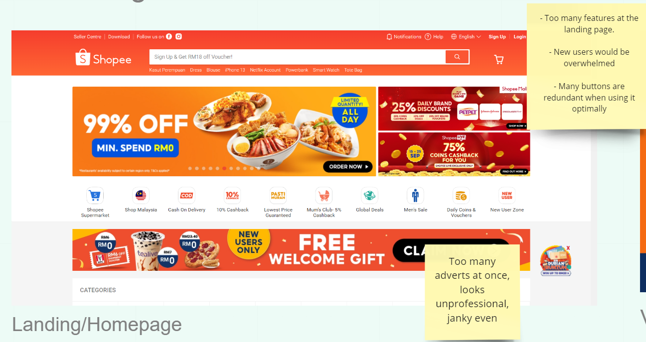
(Fig 07, Shopee Homepage, 2/10/2022)
To find ways that the current state of the website could be improved, the most important part of finding gaps in the user experience is to experience it first hand. As I personally do use the website quite often, it was not terribly difficult to find aspects which could use some work.
For example, the homepage of the website is filled with too many offers and discounts, some of which are quite misleading. These features can be considered unnecessary to the user depending on which userbase is currently using it.
(Fig 08, Shopee Product Listings, 2/10/2022)
Much of the information provided at different pages of the website is cluttered as the design principle seems to be to display as much information at any given time. At this stage, it should be noted that most of these issues are in consideration of my own personal preferences and may not reflect the more general userbase of this service.
(Fig 09, Service User Persona, 2/10/2022)
After surveying the website, a second user persona could be produced. However, this user persona is more focused on the traits of the persona that would interact with the service, rather than an introduction of the basic details of the persona.
It includes the interests and motivations of the persona to use the service, the pain points when trying to work on his goals, as well as the usage behaviour for different social platforms etc.
(Fig 10, User Empathy Map, 9/10/2022)
The next stage would be to create a user journey map. It acts like a simulation of an entire transaction performed using the service, from beginning to end. The user persona developed above would dictate how the persona would feel at different points of the user journey. At some points the experience would be progressing smoothly, and rougher at other points.
From there, a detailed idea of what is needed to be fixed in the user experience can be created. In this case, the process of browsing and comparing the desired product warrants the most caution and anxiety due to the potential of purchasing illegitimate products.
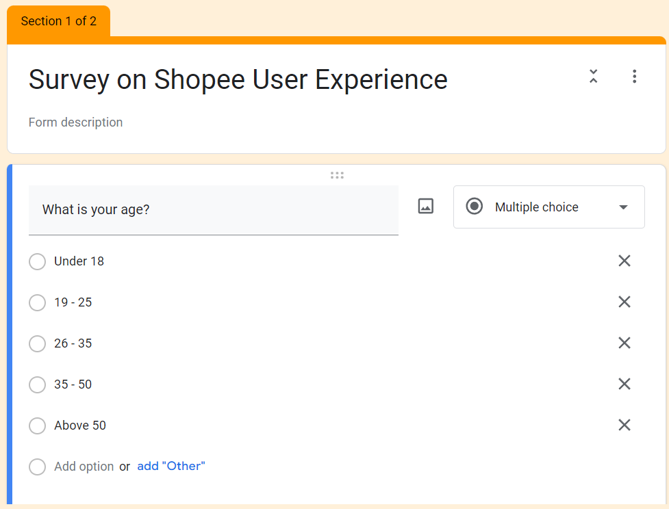
(Fig 11, Questionnaire Basic Info, 15/10/2022)
The created user persona might be the representation of an average user of the service, however it is still only one individual and its listed decisions are still an estimate at best. The best way to gather accurate data on the user experience is to collect sample data from the real userbase.
We were instructed to create a Google Form researching the userbase's opinion on Shopee and its ease of usability. The questions were formed with a process similar to the user journey map, I designed the questions by starting at the homepage, then searching, product comparison and then checkout.
Along each of these steps, I used the identified possible issues from the user roadmaps, and asked for user opinions on each of these matters.
(Fig 12, User Questionnaire, 16/10/2022)
The process begins even before the user even visits the website, by asking the user for their purpose for even visiting the website in the first place. Basic questions on how appealing the layout of the website's homepage can give insight on how well information is presented when considering the different design principles that were learned throughout this degree course.
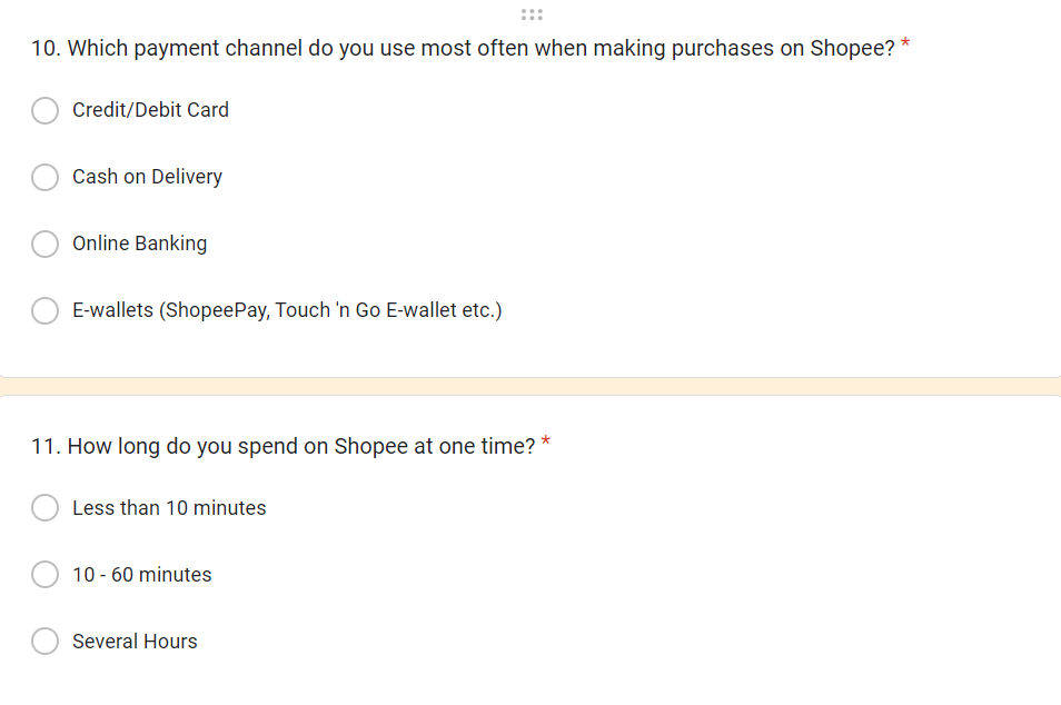
(Fig 13, User Questionnaire, 16/10/2022)
Also, some of the data that I felt was worth collecting was some concerning the users' behaviour on the website. Duration of use and preference of products are some of the decisions that could create an understanding on the spending behaviour of the users. Of course, an obligatory short answer question for how the service can be improved would also add some bonus information.
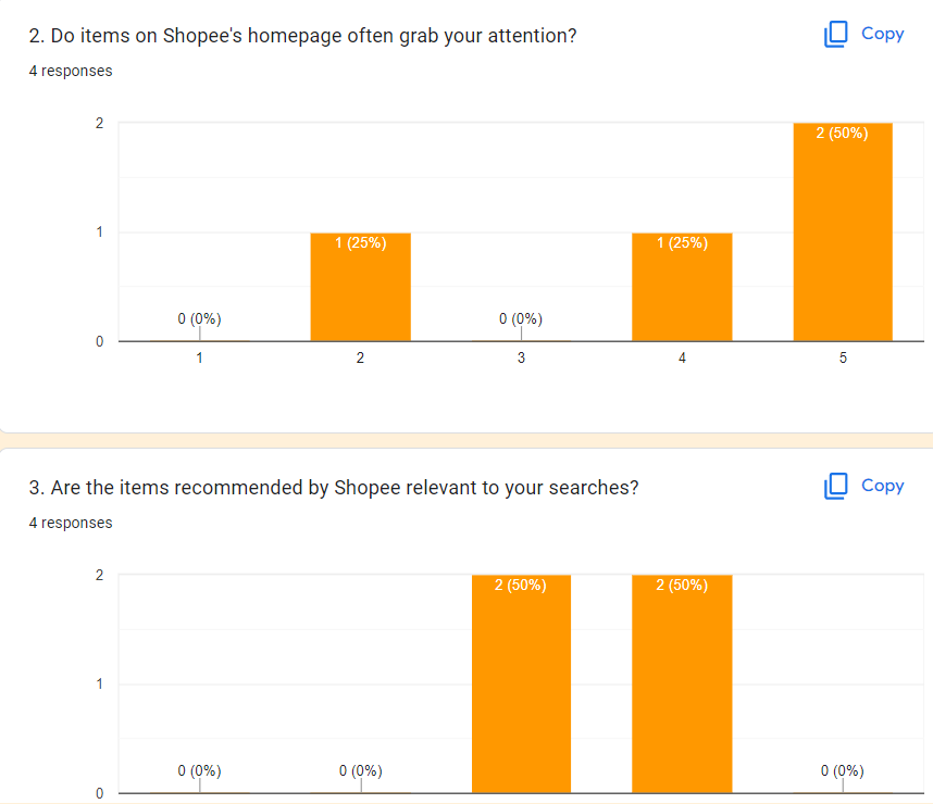
(Fig 14, Questionnaire Results, 23/10/2022)
From the collected answers, some conclusions can be drawn:
- E-wallets and online banking are the preferred payment methods.
- All users preferred reputable vendors with tags.
- Most users would actively seek out coupon codes.
- Homepage is highly attractive for most users.
- Users are mostly cautious but not fearful of counterfeit products.
After the results came in, the answers can be used in consideration of creating a new makeover for the website. As I was not taking the application design module, I was unable to utilize this information for the time being.
FINAL PROJECT
As a group, we were instructed to pick one of our peers earlier work in this module and build upon it, creating wireframes for the screens relating to the onboarding process of the app. We selected the Japanese cosmetics app Dr. Ci:Labo as there was more developed ideas for this project already and the idea of working on an application that is natively Japanese seemed novel and interesting.
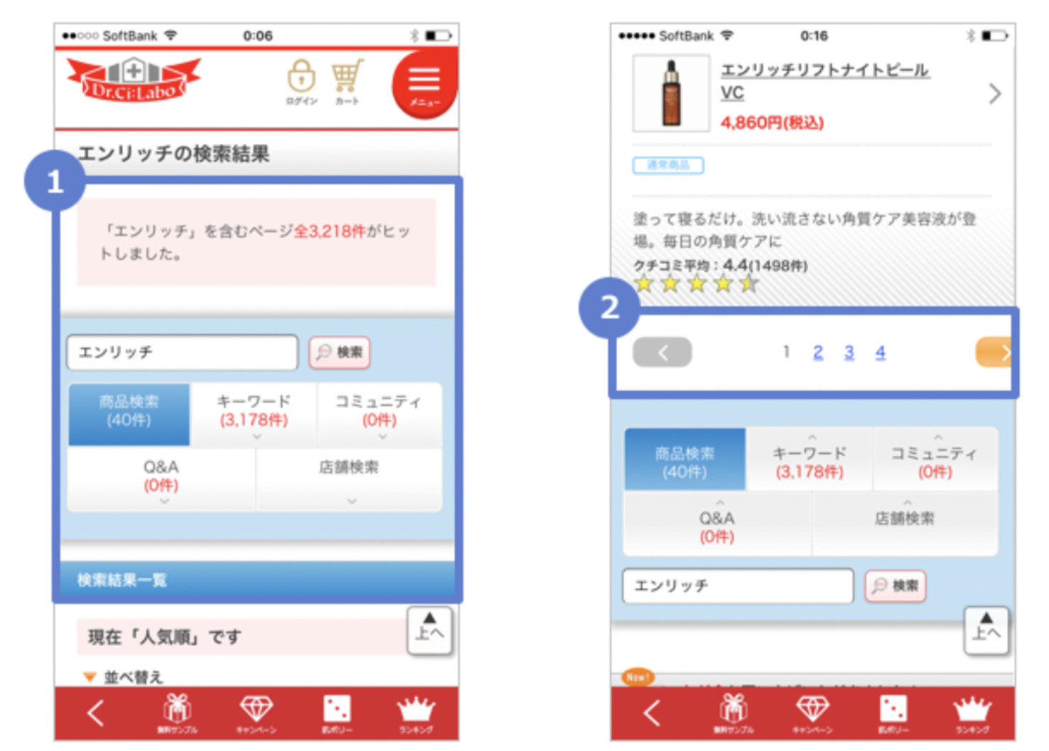
(Fig 16, Dr. Ci:Labo Screenshots, 3/11/2022)
First, we examined the various screens on the mobile application of Dr. Ci:Labo as two of our teammates aren't familiar with the design of the application. It was a little tricky getting our hands on this app as it was removed from most official sources. Luckily, I was able to find an Android package file for an earlier version of the app.
Analysing some of the parts of the app, some conclusions we arrived at that:
- The app suffered from poor layout arrangement.
- Overly cluttered screens
- Lack of coherent colour theme.
- Poor technical performance.
(Fig 17, Dr. Ci:Labo Screenshots, 3/11/2022)
Much of the navigation elements on the screens seem to be a direct import of assets from a web browser page. The elements of the page are arranged in a way that would be better displayed on a much wider screen. A slightly less related note, it seemed that the Android version of the app runs on Google WebView to display its content, which could explain its slow performance.
(Fig 18, Dr. Ci:Labo Registration Process, 3/11/2022)
One particular set of screens that we were interested in is those that are used for registration. It gives options to create an account with existing social media accounts and even fax numbers. However, one aspect that it could really improve on is that it requires an extremely large amount of information just for the sign up process, even requiring an identification number.
(Fig 18, Dr. Ci:Labo Registration Process, 3/11/2022)
(Fig 19, Hermo Startup Screens, 5/11/2022)
The landing page for Hermo also seemed more well designed from a user experience standpoint. Keeps the first time sign up screen, seasonal discount event and then the main homepage separate. The homepage also has a row of category buttons, which makes navigating to the desired category immediately accessible.
Also considering the relevance of brand reputation in the customers product preferences, the buttons for direct access to brand pages makes it faster to navigate through one of the most used steps without having to manually filter.
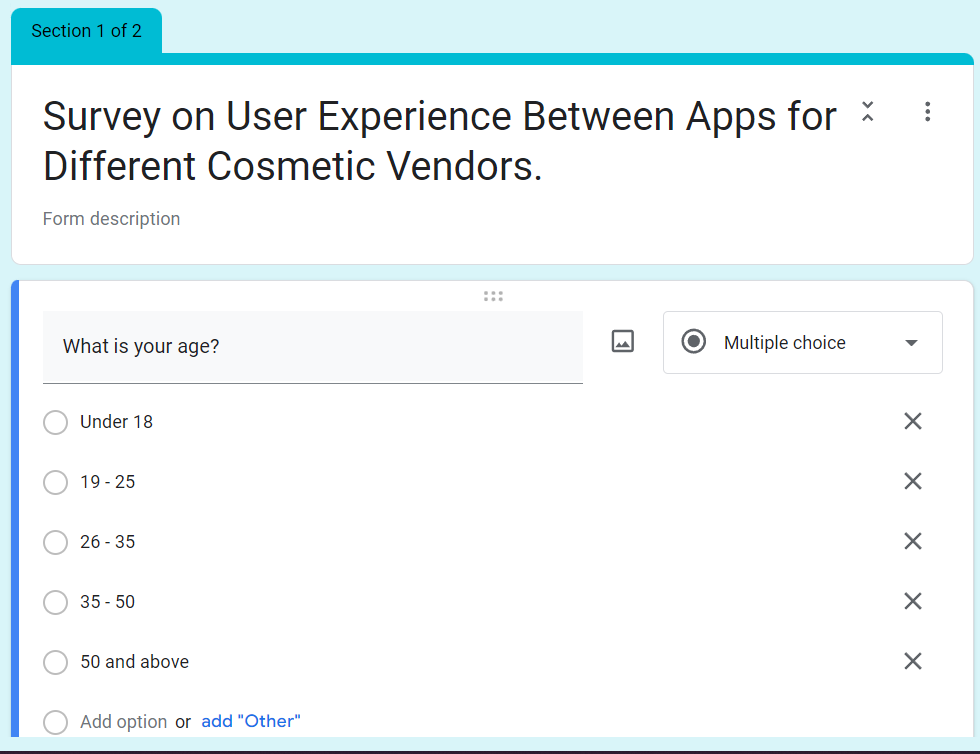
(Fig 20, Google Forms Questionnaire, 11/11/2022)
To get a better idea of the users opinions on the usability of both applications, we designed another questionnaire. This questionnaire requires people to compare and contrast various different aspects of the app, as well as more general questions geared towards both apps to get an idea of what is expected of cosmetic shopping apps in general.
(Fig 21, Google Forms Questionnaire, 11/11/2022)
When designing this particular questionnaire, it is particularly important to not be biased towards any one application. Wording is important to prevent this from happening, however the questionnaire might have to be translated, especially for the respondents from Japan, the country of origin for Dr. Ci:Labo and its intended market.
(Fig 22, Questionnaire Results, 20/11/2022)
The results that were received were skewed in preference towards Dr. Ci:Labo. Some notes left by the interviewees stated that it had cleaner visuals and is easier to use. I noted that there might be possible bias due to the fact that there is a language barrier in the Japanese demographic.
(Fig 23, Wireframe Mockups, 20/11/2022)
After the information from the questionnaire was collected, we began working on the wireframe of the application. Unfortunately, I am unfamiliar with Figma and Adobe XD as I wasn't taking the course on application design.
I began working on designing the wireframe for the redesign. Our group took some design cues from the current design of Hermo, including simple colour schemes or just thin lines to serve as user-filled text fields. A clean of professional look was the design goal for this redesign.
(Fig 24, Example Wireframe Mockup, 20/11/2022)
After I handed these wireframe mock ups to my groupmates, they replicated it in Figma to create the actual wireframes themselves. We then arranged all these designs including the research and design process into a deck for a presentation.
(Fig 25, Presentation Deck, 21/11/2022)
Reflection
WEEK 1:
WEEK 2:
WEEK 3:
WEEK 4:
WEEK 5:
WEEK 6:
WEEK 7:
WEEK 8:
WEEK 9:
WEEK 10:
WEEK 11:
WEEK 12:
WEEK 13:
WEEK 14: This week was submission week, therefore I was in quite the rush completing all the assignments that were due this week. Fortunately, most of the practical work was completed and we were compiling the slides for the presentation.
End of Semester Reflections
Experience
Designing a user interface is something that I had never learned thus far in this course. This module is meant as a sister course to the application module design offered to students in the UI/UX specialisation of the Design School at Taylor's. Some of the assignments felt half done as it was supposedly expanded upon on that module.
Observation
User experience is more than just creating a design that is appealing to a general audience. It involves pleasing the users by letting them feel at ease and in control when using the service that is provided. This involves understanding the thought process of the user when working on designing the duration spent, the navigation experience etc.
Findings
The current trend of mobile applications is a clean aesthetic that has been internationalized over the past few years. Appealing graphics paired with enticing offers are the main focus when it comes to grabbing user attention. Users also tend to prefer spending a shorter time on a transaction, even at the cost of potential security issues as made evident by the data collected from questionnaires in the module.












Comments
Post a Comment