FILM STUDIES AND CINEMATOGRAPHY - FINAL PROJECT
FILM STUDIES AND CINEMATOGRAPHY - FINAL PROJECT
MAR 28TH - 9TH JULY (WEEK 1 - WEEK 15)
NG VEYHAN (0349223) / BACHELORS OF DESIGN (HONS) IN CREATIVE MEDIA
FILM STUDIES AND CINEMATOGRAPHY
ASSIGNMENTS DOCUMENTATION
Instructions
Practical
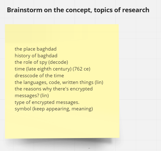
(Fig 01, Verbal Memo, 5/4/2022)
After completing the written personal memo, I began trying to figure out the direction that I wanted to take the storyline of this project. For my first attempt at storytelling here, I decided to take inspiration from my current favourite medium, video games.
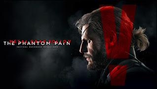
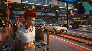
I'm quite fond of works such as the Metal Gear Solid series, Devil May Cry as well as Nier:Automata. In summary, I like works that have adrenaline-pumping scenes from either action or suspense, sprinkled with moments of lighthearted fun and goofiness. I'm also quite interested in exploring writing a cyberpunk-themed world as I felt that this genre was a little lacking in terms of "hard science fiction", with most works having almost fantastical technology rather that something that seems like a grounded offshoot of current technology.
(Fig 02, Examples of Media Used as References, 10/4/2022)
Using these games as a reference point, I managed to pin down the general idea of the work that I wanted to make. I wanted a main character who was strong by the fictional worlds standards, but the threat be big enough to challenge even the likes of him/her. It would be set in a dark, dystopian cyberpunk city, with an aspect of constant danger. The technology level of the world would be something in the near future, if technological progression was exponentially faster.
For writing the storyline, I just let my imagination reign free in terms of figuring out the events that would transpire across the story. Though I made sure to keep the story within the 3 act story structure, having the antagonist appear one time in each act might work well in a game, but less so in movie or TV.
(Fig 03, Story Beats and Ideation, 15/4/2022)
When I had completed the story beats, I had to move on to creating the concepts of the world. I'd have liked for the story to be a bit more convoluted with themes pertaining to greed or humanity tying with the growth of the main character, but I think the scope was too large for this project.
First and most importantly, I began by working on the design of the main character, as he was something that would be seen throughout the course of the story (of course). I took inspiration from the emphasis on mechanical body augments in Cyberpunk 2077, but rather than having a character that switched between them often as a benefit, would instead be a crutch that he had to rely on.
(Fig 04, Main Character Design (Hector), 5/5/2022)
One of the main required works to showcase the character was to create a turnaround of the body from different angles. This also gave the opportunity to showcase the outfit that he had. His outfit is a mix of a slightly futuristic waistcoat and shirt, and tapered pants to give the impression of formal work attire, but contrasted by the long double tailed coat with long hair to give a less put together aesthetic.
His body proportions is quite idealized rather than realistic, with a tall and lean build. As realism was not a focus point of this project, I think his body shape served its intended purpose quite well in portraying a "hero" archetype.
(Fig 05, Main Character Turnaround, 6/5/2022)
Another main aspect of the character design was the colour palette. As I had intended for the protagonist and antagonist to have strong, opposing colours, I felt that a contrast between red and blue was ideal. As Hector (the main character) was portrayed with a calm demeanor, blue would be better as the theme colour, rather than red which is more associated with a hot-headed character.
A gold trim was also used in much of the outfit to give a regal touch to his outfit, and tie both the bright white coat and the black waistcoat and pants together. I also made the inner lining of the coat a bright teal, which was supposed to glow, to give a nice splash of colour and contrast to the dark clothing under the coat.
(Fig 06, Coloured Hector Design, 6/5/2022)\
After the character design was completed, it was time to design the other part of the world, which was the environment in which the story takes place in. The city itself is first and foremost a dystopian metropolis, therefore much of the architecture revolves around tall, geometric buildings towering over tight alleyways.
As the fictional city of Shengye is located near China, obviously the native language would be Chinese. Most of the street signs and media would be presented in Chinese. Also there is a large inequality in terms of the rate of development between the upper and lower class, and this would be demonstrated by having remnants of old electrical appliances still in use alongside futuristic machines.
(Fig 07, Shengye City Draft, 12/5/2022)
The colour scheme of the city would be tied into the story. Due to the city being perpetually surrounded by a storm with close to no sunlight, there is the illusion that the city is permanently stuck in nighttime, with a dark colour scheme contrasted by the the bright neon lights of the city. Most of the signs would be made in cool colours. (i.e. blues, pinks and greens) The lack of warm colour tones makes the city feel cold and uninviting, a hostile environment.
(Fig 08, Shengye City (Coloured), 13/5/2022)
Another scene that I intended to appear in the story is the underground headquarters of the friendly faction of the story. Located away from prying eyes, the machinery and technology used in this area would be more akin to what we have in our world currently, as they do not have access to more modern technology because they had to hide.
(Fig 09, Underground Camp Drawing, 14/5/2022)
After completing the designs for worldbuilding, it was time to move onto creating the teaser trailer showcasing key moments in the story. There isn't any particular reference I had in mind when I began working on the storyboard for the teaser trailer. According the lectures on camera angles and movements, it did help me narrow down the possible compositions that I could choose for each shot.
Hector is described as a character who has things under control, until he triggers the events of the story. As such, much of the shots featuring him at the beginning were shot with upward perspectives to give a strong and intimidating impression. But as he progresses further and realizes that much stronger forces were at play, the perspective changes to look down on him and showing his uneasiness in the environment.
(Fig 09, First Storyboard Attempt, 22/5/2022)
(Fig 10, Draft Climax Scene, 22/5/2022)
After a few revisions of the storyboard and rearranging the scenes to be able to show a coherent sequence of events, I imported an audio clip that was supposed to accompany the trailer into Clip Studio Paint (the software that I was using to animate). I found CSP to be quicker instead of Adobe Animate as I was more used to the workflow in this software.
(Fig 11, PROJECT Animatic, 11/6/2022)
Before moving on to the production of the final teaser trailer, we were required to write out a script that would be used in the submitted pitch bible. We were instructed to use Scenarist as a screenplay creator, it provided separate sections for the script, world scenes, characters as well as the basic information such as titles and authors. It helped keep the information organized to be used later on.
(Fig 12, Scenarist Window, 14/6/2022)
Finally, it was time to begin making the final teaser trailer. As I wanted to incorporate 3D backgrounds into the scenes of the teaser trailer, I only had to animate the foreground characters in 2D. Sticking to Clip Studio Paint, it allowed me to continue my workflow directly from the storyboard.
What I had to do now was to refine the shapes and outlines of the characters and use a vector layer to create the final line art that was used in the animation. Some of the strengths of CSP was its feature to draw curves that weren't connected together like with the pen tool in Adobe Animate. However, the line art did look a little rough at times as different curves might not connect perfectly at times. There was a "vector magnet" tool that allowed for seamless connection of these lines, but I hadn't noticed it until it I was almost done, unfortunately.
(Fig 13, Drawing Line Art, 16/6/2022)
After the outlines of the character were complete, I had to move on to colouring. For scenes with moving shadows such as when light slowly shines across the face, I couldn't add a solid block of colour yet. Following some videos that I have previously seen regarding this process, it was more efficient to draw an outline of the shadows in its respective colour, so that these outlines were visible when viewed in onion skin, before filling in the colour of the shadows.
(Fig 14, Colouring in the Line Art, 22/6/2022)
The main characters sword is a significant prop that was used in this story. This is where another benefit of CSP comes into play, it supports 3D objects in its scenes. As much as I'd like to use this prop with its level of quality done in the 3D modelling module, the render engine in CSP is not made for 3D in mind and therefore the level of quality had to be reduced. Importing an object made in Blender to any other program did prove to be quite a pain though, with issues such as missing textures or incompatible file formats springing up.
(Fig 15, 3D Modelling Project 1, 13/5/2022)
As opposed to the traditional method of animating 3D objects by keyframing coordinates of the object across the animation to create movement, the method I used to animate the sword along the character was quite different. As I animated the character in 2's at 24fps, it meant that there was 12 individual frames. A completely smooth animation created by coordinate keyframing would have double the framerate of the animation, making it look inconsistent. To overcome this, I created a separate image of the sword in different positions for each frame, matching each frame to that of the character.
(Fig 16, Adding 3D objects to 2D animations, 23/6/2022)
Now that the 2D animation was complete, I set that to aside for now and began preparing the 3D backgrounds for each of the scenes. Some of the scenes required a high level of detail in the environments, which I unfortunately didn't have the luxury of time for that. Instead I used some of the free use 3D models that I found online.
One example is the tunnel used in the 3rd shot of the trailer. The model itself was modular, and I was able to use an array modifier to duplicate it lengthwise to create a long tunnel. As there were hardware limitations, repetitions of this tunnel in the distance had reduced quality to save on computing power as it wouldn't be noticeable anyway.
(Fig 17, Setting Up Tunnel Scene, 25/6/2022)
Most of these models did come with textures, though I had to map the textures manually to the correct parts of the object. I also had to modify the textures to help set up the scene. In the case of this tunnel, I had to change the material of the lamps in the tunnel. From an image texture that was originally provided, I changed it to a material that emitted light to help give ambiance to the scene. The scene was still too dark, so more "invisible" light sources were added to help light up the scene further.
(Fig 18, Adjusting Tunnel Lighting, 25/6/2022)
The first shot with the birds eye view of the city was more of an experiment with a new plugin for Blender that I had downloaded. It helped procedurally generate a large grid of cuboids with varying heights and widths, and I thought it would look neat if it was used to generate a cityscape, thought to a little less than satisfying results.
I also added a smoke stack to the right of the scene to show the "generator" that was a key part of the scenery, constantly outputting steam into the atmosphere, creating the rainy setting that I made for the story.
(Fig 19, City Modelling Test, 25/6/2022)
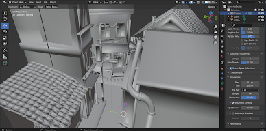
For the street scenes, it was a mish-mash of pre-generated assets as well as modelling of my own work. The challenge in making this scene was the obscenely high polygon counts that were used in the models that were imported into the scene, with my computer struggling to simplify the models before I even began texturing the models. Perhaps it was due to some incorrect import settings on my part, I probably should've looked more into that.
(Fig 20, City Scene Model, 27/6/2022)
As with all the scenes that were modelled, a camera had to be set up to give a viewpoint for the scene to be rendered. Most of these were quite simple with a pan effect. However, the 3rd shot with a zolly effect was the most challenging. It took a combination of XYZ coordinates and rotation values to be changed along with timing the focal length change in order to mimic the action I made in the storyboards.
(Fig 21, Animating Camera Movement, 27/6/2022)
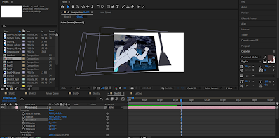
After the videos of the background were rendered, it was finally time to assemble the final video. Exporting the previous 2D animation into a stack of images, it allowed for an easier time importing with After Effects, as it automatically knew the sequence of the images. Setting the framerate of the AE composition to 24fps, it still remained perfectly timed to the audio.
After layering the foreground character into the scene, I used a lumetri colour filter to help blend the 2D animation lighting to that of the background. I think it came out pretty well for my first attempt at incorporating a 2D and 3D workflow.
(Fig 22, Combining 2D and 3D animation, 28/6/2022)
I really wanted to try my hand at drawing 2D effects by the frame, but due to time constraints this was no longer an option. For the eye in the 4th shot, it was supposed to have a separate layer on top showing a revealed mechanical face, but I only had time to add a flame emitter to the eye, with some pretty rudimentary spark effects.
(Fig 23, Adding Spark Effects to The Eyes, 28/6/2022)
To give the illusion of having a physical camera in the scene, I added a camera object to each scene and converted all the layers to 3D objects. Scaling up the background a little helped make up for the shrinking caused by moving the backgrounds further down the Z-axis.
The 3D camera feature was neat as it allowed me to alter settings such as the depth of field as well as the shutter speed of the scene. The depth of field was particularly useful when combined with the parallax effect created by moving different background layers at varying speeds.
(Fig 24, Using 3D camera for After Effect Scenes, 29/6/2022)
COMPLETED TEASER TRAILER
(Fig 25, Completed Teaser Trailer, 29/6/2022)
PITCH BIBLE SUBMISSION:
FEEDBACK
WEEK 1: No feedback yet for it was only the first week of classes.
WEEK 2: Not much work was done yet for this week, as we were assigned to start with the verbal memo for this week.
WEEK 3: The verbal memo was a bit irrelevant in terms of the personal memo and epiphany that I had written, however this might be due to the direction of the proposed script being large in scope.
WEEK 4:
WEEK 5: The moodboard was completed and presented this week. The theme might be a little too dark though, but maybe with the addition of the script it would help add to the atmosphere and make it suitable for the story.
WEEK 6:
WEEK 7: The world design was done quite well. It was a lot less ambitious than what I had initially proposed, but it served its purpose well.
WEEK 8: No feedback for this week as it was Independent Learning Week.
WEEK 9: The world design was pretty unique, especially with the twist on the cliche of a ravaged city having people living in difficulty. Instead being a city where people thrived off what was initially a disaster created an interesting dynamic in the world.
WEEK 10: The first drafts of the animatic was presented this week. As the audio of the trailer wasn't added into the animatic yet, some of the timing of the scenes did look a little off. I should add the audio to give a better idea next week.
WEEK 11: I completed the first two shots of the 2D animation. As I was still getting used to the workflow of animating in Clip Studio Paint, I was still doing fine, though I could pick up the pace a little.
WEEK 12: Most of the 2D animation was completed by this week. The animation looked quite good though I hadn't added the shadows yet. It would be interesting to see the composition after everything was combined together.
WEEK 13: As I had missed the consultation session for this week, there was no feedback for this particular week.
WEEK 14: Mr. Martin said that I was still making good progress despite it being the last week. After combining the background renders and effects, the final work would be done. While I still had my concerns, I was relieved that he still thought that I was still at a suitable work pace.
REFLECTION
WEEK 1: For what would be covered in the module, storywriting was something that I am mildly interested with since I was a little kid. Thus, I was quite interested with what the projects in this module has to offer.
WEEK 2: We were supposed to give the verbal memo, which would begin the scriptwriting process for all the future parts of this assignment. Personally, I don't think my interest in media production didn't stem from one particular moment, more likely due to my exposure to media from different generations at a young age.
WEEK 3: The ideation of the story began this week. I've been a fan of action-based media since a long time, and therefore I also wanted to incorporate aspects of this in my work. The creative process was still early on, and I'll give it some thought before proceeding further.
WEEK 4: After the personal memo and epiphany was complete, I began the worldbuilding on the project. First we were supposed to begin developing the main character, while I was still interested in creating a protagonist which was good intentioned for an action piece, I am more fond of the anti-hero archetype.
WEEK 5: The scriptwriting process was something that I enjoyed quite a lot. Especially as it was an avenue that let your imagination run wild and was not confined by reality. The setting itself was something that I wanted to keep as "hard sci-fi", which was something that was theoretically possible, even if it was impossible in a practical sense.
WEEK 6: The story for the main characters development was something that I thought quite a lot about. Actually, the main character was only half a character, the other half would be the antagonist, as the antagonist would define the motivation and act as a milestone check for the main character, and also fuel the changes in the world.
WEEK 7: I began working on the world illustration for the project. I've had some pretty outlandish ideas for the environment, at one point even considering a city that was partially submerged in the ocean and having corals growing off the buildings. However for a first attempt for the world design, I think I'd stick at something more grounded.
WEEK 8: As it was Independent Learning Week, I was able to chase up with the work from other modules, and get my work evenly distributed.
WEEK 9: This week, I've continued working on the animatic that would be used for the teaser trailer. It was difficult gauging the amount of work that I had to put into each scene, as I had to balance the quality and time that I can allocate to the work. At this point, I did wish I had more time to work on this as I know that there's more aspects that I could make better.
WEEK 10: I added the audio that would be used in the teaser trailer to the animatic. As I believe that audio is just as important to the trailer as the visuals, I made an effort to try to sync the audio of the trailer to the storyboard.
WEEK 11: The animatic was completed for this week, while there was still 3 weeks give or take for the semester, I felt quite rushed to complete the production process for the teaser trailer. This combined with my general lack of experience while experimenting with this new workflow involving 3D and 2D, I was quite concerned with the time left.
WEEK 12: The 2D animation process of the trailer was really labour intensive. As most of the animations in my trailer consists of complex movements and a stack of unique frames instead of having movements that repeat a sequence of frames, it was an amount of work that I've never tried before. I did wish I had more time to work on the shadows of the animation though.
WEEK 13: This week, I've just completed the 2D animations that were used in the trailer. There's still the backgrounds I have to complete, but having to juggle completing the pitch bible at the same time really made the schedule tight. Perhaps I have to compromise and abandon wanting to animate 2D effects.
WEEK 14: As it was the final week for the semester, I still felt that there was still a lot of work to be done, with having to render the 3D backgrounds as well having to combine it with the 2D animations. I was quite worried with the to-do list left to complete.
END OF SEMESTER REFLECTIONS
Experience
In this semester as a whole, I noticed that the workload was considerably larger when compared to semesters from the first year in Taylor's. Owing to the experiences from prior modules in this course, I did feel a level of improvement when it came to quality of my work as well as the efficiency in which how the workflow was planned and then executed. I do acknowledge that there are numerous aspects in which I have to improve before I feel confident in applying my skills in a professional environment. I think that pure trial and error is required in order to further polish my craft.
Observations
Over the course of this module, I noticed that a piece of media like animations of movie which have high practical production value can't help gloss over a fairly poor-written story, as is the case with many pieces of modern cinema. However the reverse can't be said, as a compelling story, while not having much eye-candy still has value in watching it as made evident with movies such as Forrest Gump and Pulp Fiction. While being dated in terms of technology, these movies still make me revisit the stories every now and then, while most but not all movies are a treat to watch once, but don't have much rewatch value personally.
Findings
The methods used to convey any progression in terms of the story is not only limited to visual cues such as a literal change in design of the character, though most of the time this is the most direct and effective means. A difference in how the scenes are framed can help provide insight into the thoughts of the character or even how the environment treats the character. Scriptwriting in general is quite underestimated as an art as the difference between an average and great story can lie in how the writer paces, visualizes and then presents any developments with not just obvious changes, but subtle alterations which can make repeat scenes entirely shifting the mood.






Comments
Post a Comment