ANIMATION FUNDAMENTALS - FINAL PROJECT
ANIMATION FUNDAMENTALS
MAR 28TH - 9TH JULY (WEEK 1 - WEEK 15)
NG VEYHAN (0349223) / BACHELORS OF DESIGN (HONS) IN CREATIVE MEDIA
ANIMATION FUNDAMENTALS
ASSIGNMENTS DOCUMENTATION
Instructions
Practical
PROJECT 1: METAMORPHOSIS
After the lecture session with Mr Hafiz detailing the various methods that are used in animation to cleverly disguise transitions, we started by sketching some examples of object transitions. We were each assigned an object, and we were supposed to animate a loop.
I started animating with Clip Studio Paint, as I had the most experience so far with this software. For this exercise, I animated with forward animation without any keyframes. I just had planned to convert the lightbulb into a box and back.
(Fig 01, Test Animation, 5/4/2022)
(Fig 02, P1 Draft Animation, 5/4/2022)
A week or two after completing the draft animation, I moved on to creating the metamorphosis animation itself. It was similar in principle to the draft that I had made earlier, however I would keep it simpler due to the fact that changing the perspective angle slightly was still something I wasn't skilled enough in.
(Fig 04, Metamorphosis Animation, 15/4/2022)
EXERCISE: CHARACTER TURNAROUND
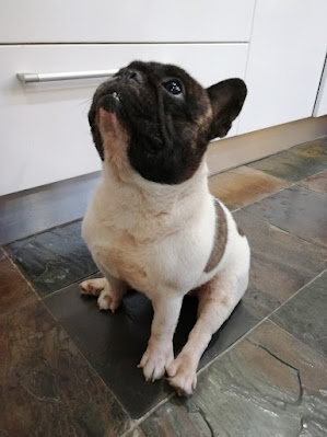
As I wasn't able to attend the trip to the mini zoo, for the character turnaround animation I used a photo of my dog as reference. I felt a sitting pose would be easier to draw from different perspectives.
(Fig 05, Dog Reference Picture, 10/5/2022)
The pose that would be used as the reference from all the other angles would be the front view of the dog. The next pose that I sketched would be the back view of the dog. As the silhouette of the subject would be identical from the back and the front, the details that had to change was only within the outline of the body.
Also due to the assumed symmetrical nature of the subject, the full turnaround only consisted of four completely unique frames, as one half of the rotation would only be a mirrored version of the first.
(Fig 06, Dog Turnaround Outline, 11/5/2022)
(Fig 07, Dog Turnaround GIF, 17/5/2022)
PROJECT 2: WALK CYCLE
We were supposed to make an animation of a bipedal subject. Following the theme from the previous exercise, the subject of this Project would be Jake from Adventure Time, which was a bulldog, similar to the turnaround exercise.
Before beginning sketching any frames, I had to look for references for the key poses of the subject that had to be used in the animation.
(Fig 08, Walk Cycle Key Poses, 25/5/2022)
I used an oval as the base shape for the body. Following the references, I first established the key poses over the walk cycle. Refining the sketch to ensure consistency across the entire animation did prove to be a little difficult, as even small inconsistencies would become quite apparent when viewed together in a moving sequence.
(Fig 09, Walk Cycle Sketches, 26/5/2022)
The stack of sketches were imported to Adobe Animate, where it was traced out with vector lines. Due to the static nature of the arms' movement, the arms were identical across the frames, with different rotations to create the movement, instead of drawing different frames.
The leg movements were a little trickier to handle, due to real walking movements having the hip sway left and right when walking forwards, it was difficult to gauge the position of the legs in this animation as the body was just one solid, static shape.
(Fig 10, Walk Cycle Line Art, 27/5/2022)
When the line art was complete, it was time to fill in the colour for the frames. I used a darker colour to denote the different "depths" of the animation, with the darker limbs being further away from the viewpoint. Afterwards, I converted the arms into symbols to facilitate easier animation for the swaying of the arms across the walk cycle.
(Fig 11, Colouring the Frame Animation, 27/5/2022)
PROJECT 3: LIP SYNC
I was looking for a source audio clip from Adventure Time to be used for this lip syncing Project. I settled on this dialogue between Jake and the character Prismo due to Jakes clear delivery of the lines as well as its perfect length.
(Fig 13, Prismo and Animal Stories, 27/8/2020)
Jakes body is largely static over this animation, I did the sketch for his body on just one layer. The face and eyes however, I made on a separate layer since the mouth had to be layered below it. Following an existing image of Jake as a reference, I managed to create a pretty well proportioned line art for his character.
(Fig 14, Jake Line Art, 5/6/2021)
Filling in the body was standard fare, similar to the previous assignments. Just the basic paint bucket tool to fill in the line art.
(Fig 15, Colored Line Art, 5/6/2021)
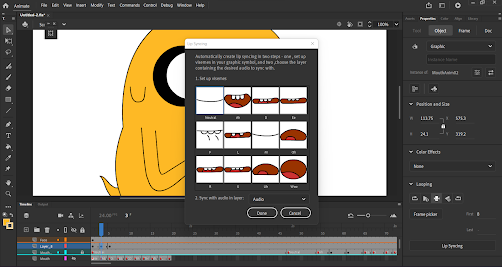
For the lip syncing part of the assingment, I took note of all the different mouth shapes and positions that were needed to create a full set of mouth movements. Some of these mouth shapes were a bit trickier to nail down, but physically making these sounds did help give an idea of how the tongue and lips are positioned to create a certain sound.
(Fig 16, Lip Syncing Mouth Shapes, 13/6/2021)
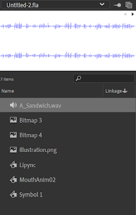
After each of these mouth shapes were completed and in their own separate keyframes, they were converted to graphic symbols, after which the lip syncing option appeared for use at the panel to the right. I imported the audio clip from the video that I picked and moved it into its own layer on the timeline,
After assigning the appropriate keyframe to the phonetic sounds required, I picked the audio layer to be used as the reference for the lip sync. Animate did all the heavy lifting and largely assigned the correct keyframes to the audio. There were a few imperfections, such as frames that were held too long. After listening and minor tweaking, I felt that the lip syncing was largely accurate.
(Fig 17, Audio Imported into Animate, 15/6/2022)
(Fig 18, P3 Lip Syncing, 15/6/2022)
FINAL PROJECT: ANIMATED COMPILATION
This assignment was just a quick animation to compile all the different works that were done across the semester. I hadn't had any real references that I used for this animation, just imagining a possible scene within Adventure Time and how they would consume media in their world.
As BMO was a character present in the show that was able to function as a small television, I felt that it was suitable to present a slideshow.
As the animation was supposed to be pretty short, I just did an animation of lifting up and then placing down BMO on the surface, where it would then display the works in this module.
(Fig 19, BMO Animation Line Art, 25/6/2022)
(Fig 19, BMO Coloured Animation, 27/6/2022)
(Fig 20, Transition Screen Test, 30/6/2022)
(Fig 21, Masking BMO Screen, 1/7/2021)
(Fig 21, BMO Face Transition, 1/7/2021)
(Fig 22, Final Project Animation, 3/7/2022)
Feedback
WEEK 1: No feedback yet for it was only the first week of classes.
WEEK 2:
WEEK 3:
WEEK 4:
WEEK 5:
WEEK 6:
WEEK 7:
WEEK 8: No feedback for this week as it was Independent Learning Week.
WEEK 9:
WEEK 10:
WEEK 11:
WEEK 12:
WEEK 13: I was still making good progress for the week. The use of lighting was quite creative rather than just using a uniform light from above.
WEEK 14:
Reflection
WEEK 1: I was quite excited for this module as it was something that I was looking forward to over the past few semesters.
WEEK 2: The simple sketching was quite fun. While we haven't really gotten to any complex animation methods yet in this module, it was a nice introduction to its various concepts.
WEEK 3: We were continuing on exploring the various transition methods that were used in animation. As I had tried to experiment with this myself prior to this module, I felt that I could understand its concepts without much hassle.
WEEK 4: I was working on the metamorphosis assignment for this week. The complete freedom of choice in terms of how I could animate the subject meant that the difficulty lied more in the trying to nail down an animation style that suited the assignment.
WEEK 5: I finished the first metamorphosis project this week. I thought that my work was quite rudimentary at this stage, perhaps owing to the lack of polished lines that were used in this animation. I'd try to do better in the coming assignments.
WEEK 6:
WEEK 7:
WEEK 8: As it was Independent Learning Week, the workflow was much more relaxed than the previous weeks. It also gave me ample time to chase up with work from other modules.
WEEK 9:
WEEK 10: There was a class trip today, however due to my place of residence I was unfortunately unable to attend.
WEEK 11: We were assigned a new assignment regarding the walk cycle. I still had to finish up the turnaround, which was fortunately not too difficult. I sketched some basic designs for a human walk cycle but missed the memo where it was supposed to be an animal character.
WEEK 12: I had already largely completed the walk cycle assignment, and what was left was the lip sync animation. As it stands, I think I would be able to complete all my work at a steady pace with some time to spare.
WEEK 13: This week, we were instructed to create the final animation to compile all the works that we had submitted. Admittedly, I hadn't seen that coming and more work was put on the table. I was quite pressed for time this week.
WEEK 14: As the semester comes to a close, much of the work across all the modules were due soon. I still thought that there was quite some work that remained to be done, therefore I was quite worried at the rate that I was progressing.
End of Semester Reflections
EXPERIENCE
In this semester as a whole, I noticed that the workload was considerably larger when compared to semesters from the first year in Taylor's. Owing to the experiences from prior modules in this course, I did feel a level of improvement when it came to quality of my work as well as the efficiency in which how the workflow was planned and then executed. I do acknowledge that there are numerous aspects in which I have to improve before I feel confident in applying my skills in a professional environment. I think that pure trial and error is required in order to further polish my craft.
OBSERVATIONS
Initially, I thought that Adobe Animate was quite finnicky to use, especially with the different parts of a curve being individually editable resulting in difficulty editing the curve as a whole. However after getting more used to the software, I found that it was pleasant to use, and that the pen tool was something exclusive to Adobe products. Animating in 2D was quite a challenge too due to the amount of effort required to maintain consistency across such a large number of frames.
FINDINGS
While working on the various assignments for this module, I felt that it would benefit me a lot more by deepening my current understanding of anatomy, both for humans and animals. While it may be more appealing to create exaggerated animations to give a character more personality, it has to be built upon a solid foundation of anatomy to make an animation look objectively appropriate. Originally, I had thought that lip syncing was still completely done manually, and the lip syncing function in Adobe Animate was quite nifty to have around.


Comments
Post a Comment