INTERACTIVE DESIGN - EXERCISE 1 & EXERCISE 2
INTERACTIVE DESIGN - EXERCISE 1 & EXERCISE 2
27TH AUGUST (WEEK 1)
NG VEYHAN (0349223) / Bachelor of Design (Hons) in Creative Media
INTERACTIVE DESIGN
EXERCISE 1 & EXERCISE 2
Lecture Notes
WEEK 1
Dr. Mike gave us a quick rundown on what does the module entail and what we were going to learn for the rest of this semester. He had also instructed us to download the suite of Adobe applications that we were going to use in the coming weeks, namely Adobe Dreamweaver.
Afterwards, we were introduced to the basics of web design. With various types of websites fulfilling different purposes, it was a given that there would be different expectations for the layouts of websites to facilitate easier navigation.
WEEK 2
For this week, we were introduced to the more technical aspects of this module. This came in the form of basic html coding which would allow us to lay down the basic framework of content in the website. First thing we were taught was how to convert a text file into a HTML file to be viewed in a browser just by changing the file extension.
w3schools.com was recommended to us as a reference for most HTML terms that we would have to use. Dr. Mike demonstrated some of the functions on a text file and displayed it on a browser, along with changing some of the parameters of the elements to make them fit on the screen better.
WEEK 3
For this week, our lecturer has been reverted back from Mr. Choong to Mr. Tarmizi. Picking up where Mr. Mike has left off the previous week, we were introduced to the <div> tag, which would be used extensively in our future assignments/projects.
<div> tags re used to define a section of the document. This section is then used to categorize certain elements to be styled together as a group in CSS.
<p> tags are used to define paragraphs of text. Blanks lines are automatically added before and after elements with the tag.
WEEK 4
Instruction
Practical
WEEK 1:
For our first weeks exercise, we were instructed to identify 5 examples of different categories of websites. Listing a few that I remember off the top of my head, I decided to look for Online Forums, Portfolios, Blogs, Ecommerce and Informational sites.
When looking for examples of these website categories, I did a quick search on each site to ensure that I have gotten its categorization correct.
(Fig 01, Alibaba Homepage, 27/8/2021)
(Fig 02, Reddit.com Homepage, 27/8/2021)
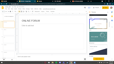
Afterwards, it was just a fairly simple affair of having to create a Google Slide documenting the notable features in the layout of each type of website. It did take a little bit of observation to discern the difference in the details rather than just the placement/presence of certain elements.
(Fig 03, Designing Slides, 27/8/2021)
PDF submission:
Exercise 1
When starting the the first graded exercise, I didn't use Microsoft Notepad in favor of Notepad++, as the latter provided a more intuitive interface, and automatically color-coded the text in according to syntax, which really helps spot mistakes easily.
Following the content that was provided, I combed through some image hosting sites for any images that would be related to the exercise. I also tested a few image formats to check if they were compatible with a HTML webpage. GIFs were supported, but for APNGs, those were not supported. For this exercise, instead of downloading the images and directing them locally, we used the source link to provide the images for the webpage.
After, I had to embed some links into certain phrases into the text. Also, I had also tried embedding a link into one of the images, as well as changing the favicon in the tab to a little Among Us figure.
PDF submission:
Exercise 2
For this exercise, we were supposed to build up the previous work in exercise 1, but instead of working on the HTML code of the webpage, we were going to add some visual changes through the use of a CSS code.
While it was possible to use CSS code on the same document as the HTML code, I decided against it as I felt it would keep my work more well organized. To begin, I created an external CSS file and linked it to the HTML through the <link rel=> code.
I referenced the website W3schools and Bootstrap to get an idea of what could be created with the more basic CSS
Feedback
WEEK 1: No feedback for this week as it was only the first week of the semester.
WEEK 2: Dr. Mike was happy with the work that I have created for the in-class exercise this week, all of what was taught in the lecture was applied correctly, and I did explore a little more with the other attributes of the page. Other than that, there wasn't too much to say as the exercise was fairly simple.
WEEK 3: There was no particular feedback this week as our lecturer changed and we were just introduced.
WEEK 4: The use of CSS was a still a little simple. I did do a proper job of aligning images as well as assigning colors to the various text in the image. However, this is something that I would learn as the lessons proceed.
Reflection
WEEK 1: While any prospects in web design isn't what I was expecting, I do expect that it would be a VERY useful tool to have in my arsenal if I am to build a space to showcase any other work in the future. Therefore I am more than willing to learn what this module has to offer, even if it may seem rather intimidating at first. Dr. Mike was also very considerate in easing us into some unfamiliar territory for some/most of us students.
WEEK 2: The work for this week is pretty interesting, as I had completely no experience in coding for any visual elements, and only experience in SQL codes for managing databases. This came a lot more naturally to me as the variables were more clearly displayed in the code and therefore made it easier to understand what variables control what.
WEEK 3: I feel that the HTML tags that were taught to us this week would be very important when it comes to future projects in terms of organizing and defining data in the document, but for the first week being exposed to these terms, I found it rather difficult to fully understand them and apply them in an accurate manner.
WEEK 4: I wasn't really used to CSS yet, having to edit two files simultaneously did make it difficult to keep track of what changes were being made at any time. Especially due to the fact that there was no way to view the progress live. It was a bit overwhelming at first, but after some time I managed to get a little better at it.
//END OF SUBMISSION//


Comments
Post a Comment