ILLUSTRATION AND VISUAL NARRATIVE - PROJECT 3
ILLUSTRATION AND VISUAL NARRATIVE - PROJECT 3
June 1st (WEEK 10) - July 11th (WEEK 4)
NG VEYHAN (0349223) / Bachelor of Design (Hons) in Creative Media
ILLUSTRATION AND VISUAL NARRATIVE
PROJECT 3
Lectures:
WEEK 10 // Idea development
Ms Noranis gave us some ideas on how to develop a good plot. By introducing the three act structure, we were given a rough idea on how to construct and pace the story to create something engaging.
Near the end of her session, she also helped review some of the plot ideas that we had thought up during this lesson.
WEEK 11 // Sketches and Design
Ms Noranis helped review some of the character designs that we had envisioned over the past week. She helped analyze the physical traits of the characters and explained to us how each of these traits help reinforce or detract from the personality of the character that we are trying to portray.
WEEK 12 - 14 // SELF-DIRECTED LEARNING
For these few weeks we were assigned to do self-directed learning and to approach Ms. Noranis or Mr. Kannan should we need help.
Instructions:
Practical:
Initially I was a little lost on what direction that I wanted to take this webtoon comic, As it was very open-ended. However, as a person who reads quite a lot of Japanese manga, I decided to take inspiration from the current titles that I have been reading.
(Fig 01, Monthly Girls' Nozaki-kun by Izumi Tsubaki) (Fig 02, Horimiya by HERO)
Eventually, I settled on using these two manga as inspirations for the theme and the character archetypes that I would be using for my work. Monthly Girls' Nozaki-kun is a comedic slife-of-life manga which focuses more on antics between friends, which is more suitable to be incorporated into my work as its length would be too short to support any realistic character development. Horimiya, on the other hand, would serve as a baseline on how I would design my characters. The duality of the protagonist Miyamura and the heroine Hori is a good reference for my work which can only include two or three characters at most.
Thinking of a plot, I went for a basic structure of:
- 2 pages for introduction
- 3 pages for the setup
- 3 pages for the confrontation
- 2 pages for the resolution
I really had close to no idea as for what the story would be about. I thought about the least uneventful situations in a school setting and that would probably be going home alone after class ends. Therefore I settled on using that situation as the setting for the story.
With the two mangas as references, I began to sketch out random character designs and hoped that something would "click".
(Fig 03, First Sketch, 9/6/2021)
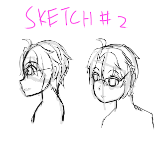
(Fig 04, Second Sketch, 9/6/2021)
The initial sketches for the main character seemed a little off to me, but after consultation on my progress with Ms. Noranis, she pointed out that the character had an overly "cool" vibe which did not contrast with the outgoing nature that I would have with the female character. Taking reference from Horimiya, I designed the main character with glasses as it seems to carry a sense of introversion, and the hair is altered a little to a more messy design.
(Fig 05, Tritagonist Sketch, 9/6/2021)
(Fig 06, Heroine Sketch 9/6/2021)
I wanted to include a tritagonist into the story at first, but felt that there wasn't enough pages and time to include a third character into the story. I was choosing between the tritagonists design and the current heroines design but eventually settled on the latter.
Now that I had chosen the designs of the two main characters, I began to storyboard the comic to better decide on the pacing of the story as well as the specifics of the plot.
The first attempt at storyboarding was done on paper at first, as it allowed me to focus less on the details and more on the overall composition of the page. After creating a rough sketch of the first few pages, I tried to refine them to basic shapes in Clip Studio Paint but eventually moved to Photoshop when remembering the motion comic requirement.
Drawing the box that the panels would sit in was easy enough with the snap to grid function, after which I began to sketch what I had done on paper onto Photoshop, some alterations were made when transferring due to certain changes in the pacing of the story.
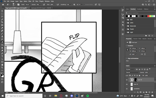
After the sketching was complete, I had to create the line art for the manga, which was arguably the most time consuming process of this entire project. At this stage I really missed the preset G-pen and mapping pen brushes that Clip Studio Paint provides as the default brush in Photoshop has pretty odd pressure settings for the pen.
(Fig 10, Drawing Line Art, 16/6/2021)
Some panels also require a white background to be filled in behind the box otherwise line art from the layer behind would show. The order of the layering was also very important as certain panels could clip with the line art of other panels if I wasn't careful.
(Fig 11, Pattern Drawing, 16/6/2021)
Certain items such as roofing requires patterns to be drawn, which I achieved by drawing a simple 2D texture and then distorting it to fit the roofs perspective. Using the perspective tool, it was quite easy to just manipulate the corners of the layer to fit onto the appropriate corners.
(Fig 12, Texture Fitting, 16/6/2021)
Once the line art for each page was complete, I had to shade each panel by using screentones. Screentones give a more textured look compared to a solid grey brush. It is added by masking an overlay of the texture and then erasing/colouring the mask accordingly to control the intensity of the tone.
(Fig 13, Inserting Tone, 16/6/2021)
Masking the tone can be a little tricky as sometimes selecting empty spaces with the magic wand tool leaves little pixel-wide nook and crannies which isn't covered when the selection is expanded. Such little imperfections have to be dealt with by going in with a small brush and adding the mask there.
(Fig 14, Masking the Tone, 16/6/2021)
Fine tuning the tone was also quite a delicate process, while the basic shapes made by shadows were easy to make, the shadows which are cast on surfaces with curved edges need to have said edges blurred and large regions of dark shadows should be brushed over with a low opacity eraser to make it look less flat. Many of these shading technique that I have learned in my own time illustrating came into play here.
(Fig 15, Edited Tone, 16/6/2021)
For certain pages, I included drawings which were a little more detailed than the normal panels, especially for the final page. For these standout frames, I treated them as a sort of "half-illustration" rather than just a simple line art from shapes. More sketching went into these drawings and I paid more attention to the anatomy of the characters here.
(Fig 16, Sketching More, 16/6/2021)
The steps above were basically repeated for the other nine pages of the manga. After I was done drawing the pages of the manga, I moved on to the motion comic part of the project. Booting up After Effects, I imported the PSD files with each page in their own composition.
Before I started animating anything, I went and color coded every layer of the composition to each panel to avoid confusion as the timeline in After Effects did not allow for folder grouping.
(Fig 17, Colour Coding, 24/6/2021)
After loading in the PSD files in its native 800x1280px resolution, I then converted the composition to 1280x720p to be rendered into the final motion comic. Animating the motion comic itself was fairly simple, mostly consisting of changing the position, scale and opacity of the layers. However, with these three basic parameters, a wide range of expression can still be achieved depending on how you control it.
(Fig 18, Animating with Keyframes, 24/6/2021)
This was also repeated for all 10 of the pages, and after that I stitched together all the separately rendered videos in Premiere Pro to create the final motion comic. I also added a guitar track that I found online onto the motion comic to give it some background.
(Fig 19, Mondays With You Animated, 24/6/2021)
Feedback
Week 10: I initially introduced a plot regarding Valentines' Day which was romance-centric. Ms Noranis said that the idea was pretty good, even if it was a little plain, she gave me the go ahead to start designing some characters.
Week 11: For the characters that I was assigned to create the previous week, Ms Noranis commented that the character I had created carried too much of a "cool" factor and didn't contrast the outgoing nature of the female lead that I designed.
Reflection
Week 10: Thinking about drawing my own manga is quite exciting. Though I know I can't find the commitment to create a series of manga, perhaps this project is a good way to dip my toes into drawing comics by only doing one chapter here.
Week 11: Designing characters is actually quite enjoyable. While the ones that I am coming up with for this story would inevitably lack any emotional depth or development, creating a short and sweet story is also charming in its own way.
Week 12: Storyboarding is actually quite a lot harder than I thought initially. When one panel is deemed unsuitable or unnecessary, it does shake up the arrangement of the page quite a lot, some have to be moved, altered or removed along the other as well. I still quite enjoy this stage of making stories.
Week 13: I am almost complete in digitizing the entire manga at this point. For the lack of details in the illustration of the panels, it still does take a substantial amount of time to complete one page, around an hour and a half. I have a lot of respect for the manga artists who can churn out twenty pages every week.
Week 14: There was a sense of satisfaction when I put down the last stroke of the entire comic, as if I had completed something entirely new in my life. Animating the compositions wasn't as bad as it seemed, at least compared to the amount of labour that went into drawing each page, either way I thoroughly enjoyed myself throughout the process.


Comments
Post a Comment