DESIGN PRINCIPLES - PROJECT 3
DESIGN PRINCIPLES - PROJECT 3
June 7th - TBA (WEEK 11 - WEEK 14)
NG VEYHAN (0349223) / Bachelor of Design (Hons) in Creative Media
DESIGN PRINCIPLES
PROJECT 3
Lectures:
Week 11 // Introduction to Project 3
Instruction:
Visual Analysis:
For this project, we were assigned to study the style of composition or illustrations of our favourite artists across any form of media. Afterwards we would use said techniques acquired from the studies and incorporate it into our own work.
I considered a few professional illustrators such as Rui Li and Sam Yang who are extremely skilled in digital painting, however I felt that their art style did not align well with my desired style. Eventually I settled on the daunting task of studying and trying to paint in the style of the artist WLOP.
(Fig 01, Winter2 by WLOP, ~5 months ago)
The arrangement of the cherry blossoms in the background are also very strategic as it helps bring a little more colour into the otherwise very uniform and bland background. The dark branches with the very muted pink from the flowers, which I presume don't reflect much light on purpose by the artist, don't detract attention away from the subject despite being one of the more stronger colours in the composition.
The size of the houses in the background also help give a sense of depth to the image. The gradual decrease in size of the rooftops along with its repetition give a quality of "humility" to the subject in the image through the sheer sense of scale, which is further reinforced by the subject just eating a small, simple dishes on a wooden table on a rooftop, nothing grandiose.
The fog in the far background also helps give the illustration a very wintery feeling as it is normally associated with a cold climate. The grey color palette of the background also helps further push this fact, which is then contrasted by the bright, strong colours of the warm meal and the subject. This is also a great example of imagery. Another nice touch is the presence of a faintly discernible figure on the balcony to the left, which does encourage and reward the viewer to take a closer second look.
All in all, I really enjoy looking at this illustration (and by extension, all his other works), as well as the "cozy" atmosphere that it very successfully portrays.
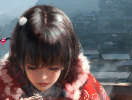
(Fig 02, A closer look, 13/6/2021)
In terms of raw technical skill, he is considered one of the best in the digital painting community as of right now and is practically a household name. The level of detail in his works ironically don't come from literal details and accurate representation of the actual material or lighting. Instead his ingenious use of simple brushstrokes help give an illusion of detail that our minds would automatically complete.
A good example would be the fur lining of the subjects jacket. At first glance it looks exactly like a wool fabric should appear, soft and fluffy. However upon closer inspection, it is just a low opacity round textured brush which even beginners would be using. His ability to bring such simple strokes to life lies in his ability to control lighting.
This point can be further elaborated by focusing on the subjects cheeks. The main light source of the image would be the sunlight shining from the top right of the image. However, there is some soft lighting on the left cheek as well. The artist has considered the fact that there is ambient occlusion from light reflecting off the jacket that she is wearing, the middle of the subjects face has no red hue in the shadow as she leans forward to eat and no light from the jacket reaches. Another absolutely stunning attention to lighting is the slightly brown rim on the ring of hard light on her hair, which can be assumed as light reflected from roofing tiles and makes the piece look even more natural and convincing.
From the edges of her hair, it can also be seen that the artist doesn't employ much use of solid strokes for fibrous materials. It can be made out that he prefers layering many low opacity strokes to create a very well-blended, light and airy looking hair. This also contrasts from the solid brush used to paint the jacket, which creates a very clear distinction from each material.
Practical
Upon beginning the creation of my own piece, I started off with the rule of thirds, as I deemed it basic and include its use in all my works. I didn't have a singular clear-cut inspiration when creating this piece. I took into account something I wanted to practice from WLOP's work, which is his very accurate and detailed use of light reflections.
Commonly, the main subjects of his drawings are in a fantasy setting with a somewhat somber mood. When thinking about a baseline for the design, I remembered a quote from a game or movie that I couldn't really remember: "Courage in the face of adversity." Something that could reflect the character of fortitude in a fantasy world would be a knight in (shining?) armour.
I imagined a scenario at random and just began to sketch away.
I haven't entirely gotten the anatomy of drawing down, while the general proportions were accurate to say the least, I felt that certain muscular curvatures were still insufficient and therefore detracted from what could've been a very dynamic pose from this perspective.
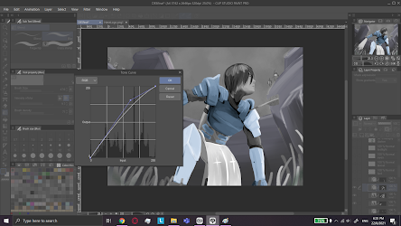
I also wanted to try colouring the image with a new method that I have never tried before, which is through the use of adjustment layers of the tone curves. Therefore I had to begin the colouring process by rendering it in greyscale before moving onto the colouring.
(Fig 04, Greyscale Torso, 20/6/2021)
(Fig 05, Greyscale Subject 20/6/2021)
Blending the greys were fairly difficult, which does show that my contrast in colours could use a lot more practice. By itself, the subject didn't look too bad, until the background was completed. As it was the subject looked pretty flat against the background, but I had wanted to use a level correction layer in order to brighten or darken certain regions later on to create better contrast.
(Fig 06, Bad Contrast, 20/6/2021)
(Fig 07, Better Contrast, 20/6/2021)
The subject looked much better against the background now. Now I had to colour it in. Since I did all the light rendering in greyscale, it was pretty much a job of cutting out various of the regions and adding a layer to change the colour curve to it's desired level. It's my first time colouring by editing a curve graph so I was quite unused to it and the colours sometimes came out a bit flat than I wished.
(Fig 08, Basic Colour In, 20/6/2021)
I wanted to keep the background less detailed as it would divert attention away from the subject, therefore I kept the large simple strokes and coloured it in like I had the subject. I also added some clouds and a light sprinkling of stars to create a somewhat evening scene.
(Fig 09, Basic Colours Completed, 20/6/2021)
Now I had to render the lighting, as the artwork currently is just a mish mash of randomly coloured components. Using different layers with specific blending modes, I casted a large shadow on the torso and abdomen as the hunched position prevents sunlight from reaching, as well as subtle colours on the steel armor to create a more cohesive lighting scenario. The sword also a glint added to it to show light hitting the blade.
(Fig 10, Subject Lighting Rendered, 20/6/2021)
Now all that was left to touch up the environmental lighting. I had already established the light source beforehand, but did not change the direction of the shadows casted in the background accordingly. I amended that mistake and added some glow to the grass to show sunlight hitting. Some fog was also added at the back to give a little more "texture" to the background.
(Fig 11, Overwhelming Odds, 20/6/2021)
In terms of the concepts that I had wished to convey with this piece, I felt that I have created contrast with the bright saturated contrast of the overall subject from the comparatively dull castle wall background. More contrast is also achieved with the bright red blood on the white sword to draw viewers attention as it is the only source of red here. The location of the blade and the subjects head near the corner of quadrants also demonstrated use of the rule of thirds. To help the composition further, the bright green grass and the tall buildings help frame the subject to create a more appealing composition. The multiple archers set up in the scenario is the use of repetition to show and reinforce the fact that the subject is in dire trouble.
Timelapse:
PDF submission:
Feedback
Reflection
Week 10:
Week 11:
Week 12:
Week 13:


Comments
Post a Comment