DESIGN PRINCIPLES - PROJECT 2
DESIGN PRINCIPLES - PROJECT 2
May 20th - 3rd June (WEEK 8 - WEEK 10)
NG VEYHAN (0349223) / Bachelor of Design (Hons) in Creative Media
DESIGN PRINCIPLES
PROJECT 2
Lectures:
WEEK 8 // Independent Learning Week
While there was no actual lectures this week, this project was assigned to us during this period of time.
WEEK 9 // Wesak Day
Coincidentally, there were no classes for 2 weeks in a row due to a holiday. There was nothing of note this week and progressed through the project as normal.
WEEK 10 // Review and Consultation
This week, Dr. Charles helped us students who were still stuck with the project. He gave us ideas on how to gain inspiration from our surroundings. He also showed us fun little ways to enhance the composition of our image such as not limiting oneself to the borders of the image. We were also instructed to not limit ourselves to what's directly in front of us. Learning how to interpret a scene with your own imagination was also an important aspect of being a designer.
Instruction:
Practical
Visual Research
Before I began to sketch anything, I wanted to get some reference pictures, which Dr. Charles recommended that we can get just from our immediate surroundings. I would just take some pictures of my room as it is, the difference being the angle that it was taken from.
(Fig 01, A Particularly Intriguing Reference Image, 1/6/2021)
Another talking point of the image was the contrast in the foreground and background. My room is built with the windows facing mostly north, therefore the sun never shines in, leaving my room mostly dark most of the day. Frankly, I believe this was also a responsible factor for quite a miserable time for a few years, being cooped up in a dark environment for long periods. I could make a story with the contrast.
The subjects itself was also something that I thought about. The guitar in the picture was something that I picked up doing said rut in my life, I had stopped playing the guitar before but picked it up again during that time. Being that devoted to something at the time was a really strong feeling and I wanted to include that in my art.
(Fig 1.5, A beach in Aceh, Indonesia, 14/6/2016)
I took this picture when I went kitesurfing with my father on a beach an hour or two away from Bandar Aceh in Indonesia. Being one of the reference photos I used when deciding the atmosphere of the composition, I found it interesting that there can be such a strong difference in brightness despite the sunlight and shade being so close together. I found the environment really relaxing as there are only other kitesurfers present and everyone gave off a really friendly vibe, which for a moment helps detach yourself from the stresses of daily life.
(Fig 1.2, Beach Lodgings, 15/6/2016)
During my short trip there, the sun was always shining so fiercely. It gave the surroundings an atmosphere that it was brimming with energy. It was the quintessential portrayal of a tropical paradise really. Only downside to that trip was that I was underaged to drink beers. Back to the topic at hand, the fact that most people would enjoy being in the shade, I thought of an analogy that many people would stay in idleness (represented by shade) in fear of pushing hard to live life to the fullest in the face of all the challenges it entails.
Idea Exploration
Now I had to consider the final composition of the room itself. My room is by no means a pretty one, maybe a little messy too. So I had to construct an "imaginary room" still largely based off my room. Drawing up a space and switching around the pieces of furniture in my room, I looked for an arrangement that could allow for a good composition.
(Fig 02, Room Arrangement Test, 1/6/2021)
I am quite confident in my skills for spatial awareness, with the composition that I had above, I sketched out a test of what the shot would look like. The guitar in the initial sketches looked a little too far from the camera, therefore I moved it closer, but had to compensate later on with a strong blur effect to show focus on the person.
(Fig 03, Prelim Sketch, 1/6/2021)
Process
Not long after I reached a sketch that had desirable proportions for each element. At this point I had begun to work on colouring the image. Wondering whether I should fill basic colours first then render it after or completely render each part before moving on to the next, I decided to go for the latter. Minor adjustments were also made to the shot as I went on.
(Fig 04, Outlines, 2/6/2021)
After completing the outlines, the hard part of colouring and rendering was here. I was used to operating illustrating software therefore the rendering of basic solid colours was done following a few steps:
- Drawing solid shadows with a normal brush of a darker colour
- An airbrush with a multiply blend mode helped create smooth ambient occlusions
- A highlight-type brush was used to create a strong key light for surfaces exposed to direct sunlight.
- A similar airbrush but with a glow dodge blend mode is then used to create a glowing effect of light reflecting off surfaces.
- Finally a dark blue overlay is drawn over dark regions to create a strong, more saturated colour in the shadows.
There were also a lot of smaller tricks here and there to add texture and make large regions look less flat but listing them too would make the list too long. I would then repeat these steps for every part of the image, switching around the steps depending on how the objects were placed in the composition.
(Fig 05, Rendered Subject, 2/6/2021)
In the case of the guitar, I lifted a trick that many manga artists use in their works. In order to create consistent textures for objects such as tables, an overlay type texture is masked and placed on the desired surface with an overlay or soft/hard light blend mode to incorporate the texture into the surface.
(Fig 06, Screening Wood Textures, 2/6/2021)
The process was a little long, but manageable nonetheless. I made sure to control the strength of the dark blue overlay layer according to their distance from the light source (the window). The dark guitar in the foreground also looked a little flat, therefore I added a little blue ambient lighting, that could be reflected from a nearby blue surface for example. With that, the steps to do basic rendering was done.
(Fig 06, Before Final Render, 2/6/2021)
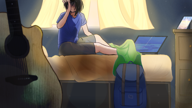
After that, it was time for the final render of the image. I added some light shafts to create dark regions of the subjects shadow to show direction of the lighting. Low opacity white circles were also added to create a dust effect and add texture. I also added a glow over the curtain as it was supposed to be absorbing most of the light coming in. A light vignette was also added on the wall to create a more dynamic appearance. The image was finally done.
Final Outcome
PDF:
Image:
(Fig 07, Discovery of Logical Positivism, 3/6/2021)
Rationale:
I really wanted to reflect the feeling that I suddenly had one day following a particularly rough week. It was at that moment I learned to enjoy and appreciate life for what it is despite not consciously thinking about it. It was just a regular weekend like any other, but as I opened the blinds, beams of white light shot into my room as it gave the room a soft glow, as if it meant to caress my body in its warm embrace. As I looked outside, was the sky always so blue? Everything around me seemed to become more vivid in colour. Despite the same scenery that is repeated everyday, there is still beauty to be found. Right now, it would be a waste to not do what I love. Before I knew it, I was already reaching for my guitar. Life is looking up now, that's the message I wanted to convey in this piece.
Feedback
Dr. Charles praised by strong use of specific props in the composition to create a narrative, as well as using the size and arrangements of the props to emphasize and contrast each element from one another. The subtle use of light shafts to show directional lighting was also a positive point of my work.
Reflections
Week 8: At first, I was confused at the premise of the project. The phrase "Sense of Place" made little sense to me at the time. I wondered if it meant "to create an atmosphere" or "to tell a story with a place". After some thinking, I decided to include elements of both descriptions.
Week 9: I didn't focus as much on this project this week as there were other classes that took higher urgency in the week.
Week 10: During this week, I had to illustrate the final piece. It was interesting applying some techniques I remembered from 3D modelling when I saw the works from my fellow classmates. To construct a spatial room just from drawing and imagining a camera in the space was something that I wouldn't have thought of doing without seeing the works of others. I guess we all learn something new everyday.


Comments
Post a Comment