TYPOGRAPHY - TASK 2
TYPOGRAPHY - TASK 2
May 4th - May 17th (WEEK 6 - WEEK 8)
NG VEYHAN (0349223) / Bachelor of Design (Hons) in Creative Media
TYPOGRAPHY
TASK 2
Lectures
WEEK 6 / Designing a 2-page Spread in Adobe InDesign
Already familiarizing ourselves with doing typesetting procedures such as kerning, tracking and cross alignment by doing the assigned practice in Week 5, this week Mr. Vinod instructed us to begin working on this task. In the lesson, we made a mock up sketch of a design for the 2-page spread and he gave us some comments and ideas on how to further proceed and refine our designs.
Week 7 / Refining the 2-page Spread and Basic Introduction to Typeface Creation
At this point, we were expected to know our way around Adobe InDesign fairly well, and therefore less focus was placed on this task. Mr. Vinod reviewed the compositions we have made and gave a few comments on how to improve. Soon after, he switched to explaining the basics of Task 3, and how to set up the ascending/descending lines, capital lines, x-height lines etc. to help us align the text that we were to create and gave us a quick demo.
Week 8 / Finishing the Composition and Creating Typeface
It was the assigned Independent Learning Week, and no lessons were conducted this week. We were instructed to utilize this given time to complete Task 2, and work on creating the typeface for Task 3.
Instruction
<iframe src="https://drive.google.com/file/d/181_VE8vfcKqdWZoCtwbL4xlVtYLIPE7W/preview" width="640" height="480"></iframe>
Practical
First, I had to settle on the overall composition of the layout before working on the final details. During the lesson, I made a quick sketch on how I could arrange the given text. We were also given ample time to do a mock up of the composition we made.
(Fig 01, Rough Sketch 1, 4/5/2021)
(Fig 02, Attempt 1, 4/5/2021)
After having the design reviewed by Mr. Vinod, I decided to keep the core element of the large arrow. However, I had to entirely redesign the left page of the spread as its design was unsatisfactory. I tried to do a few more mockups with variations in the left page and preserving the design of the page on the right.
(Fig 03, Rough Sketch 2, 4/5/2021)
(Fig 04, Rough Sketch 3, 4/5/2021)
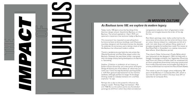
In the end, I chose the latter sketch, as I felt that there was less "unused space" in the page and therefore looked more complete. The design could still use a lot more refining, therefore I continued to alter the design in order to create something that was more visually coherent. Cropping out an excess section of the arrow, I decided to put "non-keyword" elements in the arrow.
(Fig 05, Final Composition, 6/5/2021)
To begin making the spread, I decided to tackle the most visually significant element of the the composition, which was the arrow. Taking a screengrab of the InDesign screen with the document grid, I inserted the screen into Illustrator and used that as a reference for proportion.
(Fig 06, Arrow Design, 6/5/2021)
The arrow was the only element that was designed in a software other than InDesign. Porting it back, I started to implement the text into the arrow. Trying to align the text pixel perfect to the edges of the arrow, I noticed I also had to account for the stroke width of the text.
(Fig 07, Arrow/Text Alignment, 6/5/2021)
(Fig 08, Cross Aligning, 6/5/2021)
After receiving some advice on how to improve the current composition, I made some tweaks to make the final spread, largely utilizing the same techniques above.
PDF submission:
Feedback
Week 6: Mr. Vinod commented that while the arrow concept was interesting and could potentially work if executed correctly, but the left spread of the first layout design had a lot of "negative space". He encouraged me to experiment more in order to find a layout that can best utilize the concept of the arrow.
Week 7: The concept of using the arrow could still use refining. The current spread I made at the time wasn't bad, Mr. Vinod recommended that I move all the text that was outside of the arrow into it so it would appear more organized. The thickness of the arrow could also be made uniform, but that was up to my discretion.
Week 8: It was Independent Learning Week at the time and no class was conducted, and the week was used to finish up this Task, therefore no feedback was given this week.
Reflection
Week 6: Learning to operate InDesign was fairly tricky, as it was quite different from the illustration or photo manipulating applications that we were used to currently. The default user interface presented by InDesign was also very barebones, therefore I found it a real hassle to look for each function under the drop down menus, until I altered the workspace settings.
Week 7: This week was pretty heavy on new information. We were instructed on how to create a new typeface, therefore it was relatively difficult to catch everything that was going on. The advice that I received on the composition was helpful though, as I felt that the typography was lackluster in some manner that I couldn't pin down.
Week 8: Given it was an extra week with no new assignments, I felt that there was ample time to work on this composition as well as working on the newly introduced Task 3. Making some minor adjustments to the composition didn't prove too difficult.


Comments
Post a Comment