DIGITAL PHOTOGRAPHY AND IMAGING - WEEK 6
DIGITAL PHOTOGRAPHY AND IMAGING - WEEK 6
May 3rd (WEEK 6)
NG VEYHAN (0349223) / Bachelor of Design (Hons) in Creative Media
DESIGN PRINCIPLES
WEEK 5
Lecture Notes:
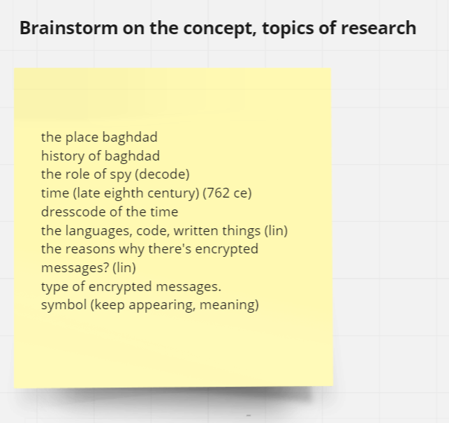
Starting of this weeks lecture, Mr. Yusoff gave us a refresher and explaining Project 2 in greater detail. Today, he focused more on helping us the develop the concept for each of our posters. To start off designing our posters, we should:
- Define the Title, Slogan and Call for Action
- Do a rough mockup of the poster
- Insert the information into said mockup
When designing the poster, we should stop every once in a while and give the design a quick look and consider if it still conveys the message that is intended. Certain elements can be included in order to evoke certain feelings in the audience.
Google Slides Breakdown:
Practical
For this week, we are intructed to add colours to what is initially a monochromatic image. The breakdown slides explained that we were not limited to one particular method, we could utilize separate colour layers, filters or masking the image.
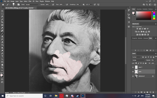
(Fig 01, Test Skin Colour, 5/5/2021)
Colouring the skin first meant that I had to figure out all the layer settings that I was going to use for most if not all of the following layers. While playing around with the blend mode and layer properties, I decided to go with the overlay blend mode as I have utilized this function before when illustrating digitally. Setting the opacity to 70% also let enough detail be shown through the solid colours.
(Fig 02, Colouring In Sclera, 5/5/2021)
When colouring areas with more specific shapes, I couldn't let the various layers I used overlap as the the way overlap functions as a blend mode is that it is determined by the layer below, therefore, I selected the other layers and inversed the selection for a quick mask to prevent overlapping.
(Fig 03, Colouring Eyebrows, 5/5/2021)
Eyebrows were also another part that required a little thinking. The thickness of the eyebrows get thinner when further away from the center, to prevent a hard edge being too strong when defining the shape of the eyebrow, I thought to use the smudge tool to stretch the colour while lowering the opacity while doing so. This provided a smoother transition from eyebrow to skin, which I also applied the same technique to the sideburns.
(Fig 04, Lip Colouring, 5/5/2021)
(Fig 05, Shade Colouring, 5/5/2021)
(Fig 06, Final Recolour, 5/5/2021)
Feedback and Reflection
Feedback:
Reflection: The exercise for this week is something that I am somewhat familiar with, as I have used to overlay blend mode quite frequently when rendering lighting in illustrations. The precision that is required however, is trickier compared to the more rough nature of digital painting. I have to focus more on developing my concept for Project 2 as currently I have no clear, concise theme that I want to convey.


Comments
Post a Comment