ART DIRECTION - FINAL PROJECT
ART DIRECTION - FINAL PROJECT
MAR 28TH - JULY 9TH (WEEK 1 - WEEK 15)
NG VEYHAN (0349223) / BACHELORS OF DESIGN (HONS) IN CREATIVE MEDIA
ART DIRECTION
ASSIGNMENTS DOCUMENTATION
Instructions
Practical
As a class, we started by splitting ourselves into two groups that we would stick with for the rest of the semester. Afterwards, we took the week to explore the target game that we were suppose to invent a new artistic direction for: Among Us. Before this I had never even as so much touched the game, and therefore there was a lot to take in for me.
Once we went for a few rounds of the game, we were instructed to go into our individual groups and create a board detailing all the good and bad aspects of artistic design that was used in the game. The general consensus of that we arrived at is that the overly simplified art style, while not inherently bad, did not offer much in terms of variance and customization. Also, the UI was quite the mess, especially on the mobile platform.

(Fig 01, Identifying design aspects, 4/4/2021)
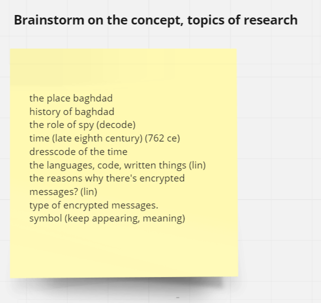
For week 3, we took the information we had gathered from the previous week and tried to brainstorm an entirely new narrative with a new theme/style to accompany it. We began just throwing out some random ideas and give it some thought to see which elements could connect with each other.

(Fig 02, Brainstorming, 11/4/2021)
To start any development on the designs of the revised assets for the game, a mood board was to be established in order to visualize the general direction of the art style that was used in the game. Most of the games with cooking as a theme that we had thought of came from old flash games, and cooking games seemed to have a decline in more recent years as we were hard pressed to find any within the past few years.

(Fig 03, Developing a mood board, 11/4/2021)
To refine the gathered materials, a positioning graph and "is/is not" statement list was created to identify the qualities that we wanted for the final design to have. The mood board references were then arranged in an artistic target graph, in order to gauge how relevant we feel each source would be for the final design for the game.
Before we started redesigning any assets from Among Us, we took some screenshots from the game itself to get an idea on the composition of the page as well as being able to identify the different assets that we have to create in order to create a complete page.

(Fig 04, Compiling Source Material References, 18/4/2022)
Sometime during this process, we worked on thinking of a name for the game. We didn't dwell too long on this aspect of design. We tried variations on wordplay as well as names at random. In the end, we settled on the name "Among Cooks" as it simple and worked well enough for the purpose of this Project.

(Fig 05, Name Ideas, 20/4/2022)
Our entire group worked together to brainstorm some simple character designs to kickstart the process for creating other assets as well. As characters were something that the player would be looking at throughout the majority of the game, we wanted each individual character to be unique with strong identifying traits. Originally, we wanted to go with something with a more "cartoon human" design, however considering the fantastical setting of the game, we decided to go for something more wacky.

(Fig 06, Character Description + Sketches, 25/4/2022)
I was assigned to be in charge of redesigning the storage room of the map. Overlaying the original design of the map, the shape of the room was preserved, however the items present in the room itself would be changed in order to reflect the differences compared to the original game. I wanted to give the storage room some aspects of "dark humour" by referencing some dodgy practices being performed out of the customers view by adding some mildly disturbing props.

(Fig 07, Environment Sketches, 3/5/2022)
Making a redesign for the main menu screen of the game, we gathered some examples from various mobile games that we came across. There seems to be a trend in the examples that most casual mobile games have interfaces that are very "child-friendly", with rounded edges and large, fun-looking text paired with bright saturated colours.

(Fig 08, UI references, 3/5/2022)
Exploring the various typeface options for the game, some of what I learned in the previous typography module from past semesters did come into use here. As this was a game with a casual demographic, a sans serif font was ideal as it gave a less formal impression.
For the level that we were designing, it was supposed to be an Italian restaurant. For the menu prop that would be used in the game, a cursive font gives a fancy impression reminiscent of menus in high class restaurants, despite its slightly lower legibility.

(Fig 09, Possible Typefaces for the Project, 5/5/2022)
After finalizing each of our individual parts for the map, we scaled them appropriately and combined them to ensure that the overall map design was cohesive and bounced well of each other. We also plotted and standardized the point size to be used for different parts of the line art, but the color scheme was still left to our discretion at this point.

(Fig 10, Combined Environment Sketches, 12/5/2022)
Creating the line art for the map itself was not a difficult task, as it was mostly based off the sketch art that was made earlier. Some minor adjustments were made to smaller details such as the leaves on plants as they were a bit too detailed for my current skill at vector drawing. All of the lines were created in black initially, and the appropriate colour would be added in afterwards.

(Fig 11, Storage Line Art, 13/5/2022)
After the line art was completed, I proceeded into Photoshop to complete the colouring for the room. For the floor tiling, the pattern was entirely made in Photoshop as it was easier to create texture sheets, something that I picked up from my 3D modelling module. The colour was filled in separate layers to facilitate easier change of colour variations.

(Fig 12, Storage First Colour Pass, 3/6/2022)
Compared to the other rooms that were designed by my groupmates, the colour was quite dull in comparison, with dim lighting. To fix this, the colour palette was changed to a much more saturated bright blue and pink. Some of the designs on the boxes were redone, as well as a stack of boxes was added to the room to make it seem more populated, and less empty.

(Fig 13, Storage Line Art, 20/6/2022)
When the rest of the assets were completed, they were compiled into a series of mock screenshots of the game.

(Fig 14, Final Example Screenshots, 21/6/2022)
Feedback
WEEK 1: No feedback yet for it was only the first week of classes.
WEEK 2: As we were exploring the base reference for this semesters project (Among Us), we were able to identify the differences between the game and its contemporaries such as Goose Goose Duck, as well as identify their strengths and shortcomings in terms of the user experience.
WEEK 3: For the collage of references that we would be using for our project, it could use some refining in order to paint a clearer picture of what we were aiming to achieve. On the other hand, our proposed mechanics such as the roles system based on Werewolf were met with quite a positive response.
WEEK 4: For this week, we were collecting the visual references from Among Us for the project. Therefore there wasn't much feedback for this week.
WEEK 5: For the character designs that we had presented, some of them were not consistent with each other as the flaming character and chef character didn't seem to mesh well together in a theme. For the environment design, we should take caution in making them look consistent in terms of line art.
WEEK 6: The basic environment design could still use some work. Now that the line art was finished, Ms Anis could give a better opinion on the consistency of the line art. It still needed some work in terms of thickness, as some detail line art were thicker than others.
WEEK 7:
WEEK 8: No feedback for this week as it was Independent Learning Week.
WEEK 9:
WEEK 10: The improved character designs was quite well received by Ms Anis. The bright colour of the flame character was quite creative with the use of burn marks being used as a death marker for a character.
WEEK 11:
WEEK 12: Due to some unforeseen circumstances there were no live feedback for this week. Though Ms Anis did look over our progress for the week and said we were doing great.
WEEK 13:
WEEK 14: As per Ms Anis' feedback, both of our teams did quite well on our final presentations. While some of us could use a little more confidence when it came to presenting our works, the produced result was still a solid end to the work for this semester.
Reflection
WEEK 1: For the start of the semester, I wasn't really sure what to expect from this module in terms of what the workflow entails.
WEEK 2: As I had no prior experience with the game Among Us, I jumped into this exploration of the source material pretty much blind. Honestly, I wasn't fond of the social deduction genre of games as a whole.
WEEK 3: Collecting the various materials that we were going to use as the moodboard for the project, my groupmates and I found out that we had quite similar experiences when it came to playing old Flash games when we were younger.
WEEK 4: As we were still collecting the visual references from the game Among Us, there wasn't much in terms of workload for this week. All that we had to do was collect a number of screenshots.
WEEK 5: A lot more of the creative process was involved this week, as we began designing the various rooms and assets that we were assigned. At this point I felt the work that was given in this module felt like a blend between the Design Principles and Illustration modules from the first semester.
WEEK 6: We were still largely working on redesigning the various rooms and characters of the game. As I had completed the sketch of the storage room, I contributed a little in helping design the logo and exploring typeface options.
WEEK 7: At this point the beginning of the final design was about to take root. This week we were supposed to do the line art for the various assets of the game. I was quite happy to see that we were entering the practical production phase of this module now.
WEEK 8: As it was Independent Learning Week, the workflow was much more relaxed than the previous weeks. It also gave me ample time to chase up with work from other modules.
WEEK 9: With the final line art done, we had to get the green light from Ms Anis before proceeding to colouring the environment. The line art still needed a little work, but I was happy with the progress our group was making.
WEEK 10: At this point we reached the stage of colouring the environment. I was still refining the colour palette that we would use for the different parts of the map. I did find it quite difficult coordinating the contrast and colour saturation between the rooms, rather than just basic colours.
WEEK 11: The basic colour of the environment were done this week. It looked a little like a hodge-podge of different colours, possibly due to the inconsistent lighting. I think a lot more refining had to be done for the lighting, otherwise the map would look incoherent.
WEEK 12: I think the work pace currently is still quite comfortable, as we didn't have much left in terms of work, and there was still 2 weeks left in the semester. I still had to create a variation or two of the redesigned storage room, but I think that could be dealt with fairly quickly.
WEEK 13: It was a bit of a rush creating different colour variations for the map. As the method I used for colouring in Photoshop was different than those used by my peers, there's been some miscommunication in sharing our work. We did manage to complete everything in time, though.
WEEK 14: As the semester comes to a close, much of the work across all the modules were due soon. Fortunately, the bulk of the work in this module had already been completed the week prior in preparation for the final presentation.
END OF SEMESTER REFLECTION
EXPERIENCE
In this semester as a whole, I noticed that the workload was considerably larger when compared to semesters from the first year in Taylor's. Owing to the experiences from prior modules in this course, I did feel a level of improvement when it came to quality of my work as well as the efficiency in which how the workflow was planned and then executed. I do acknowledge that there are numerous aspects in which I have to improve before I feel confident in applying my skills in a professional environment. I think that pure trial and error is required in order to further polish my craft.
OBSERVATIONS
I found that much of Adobe's software is really smooth when working alone, but it came up short when creating collaborative projects, though this might just stem from my lack of experience. I would've liked to see something akin to a template file for settings that can be applied across a project. While working together was a neutral experience for me, I did feel that my communication of ideas did improve, albeit a little.
FINDINGS
I noticed that having multiple people coordinating together to create on piece of work is no easy feat. As most people have their own preferences and style in which they work, sometimes it can be difficult to communicate ideas in terms of expectations of each other. I think this is what separates a good and great team member in a collaborative effort. In this front I think that I have a lot to improve on. The designing aspect of this module was also quite enjoyable as it is slightly resembles what I expect from a professional environment in terms of working as a team.

Comments
Post a Comment